
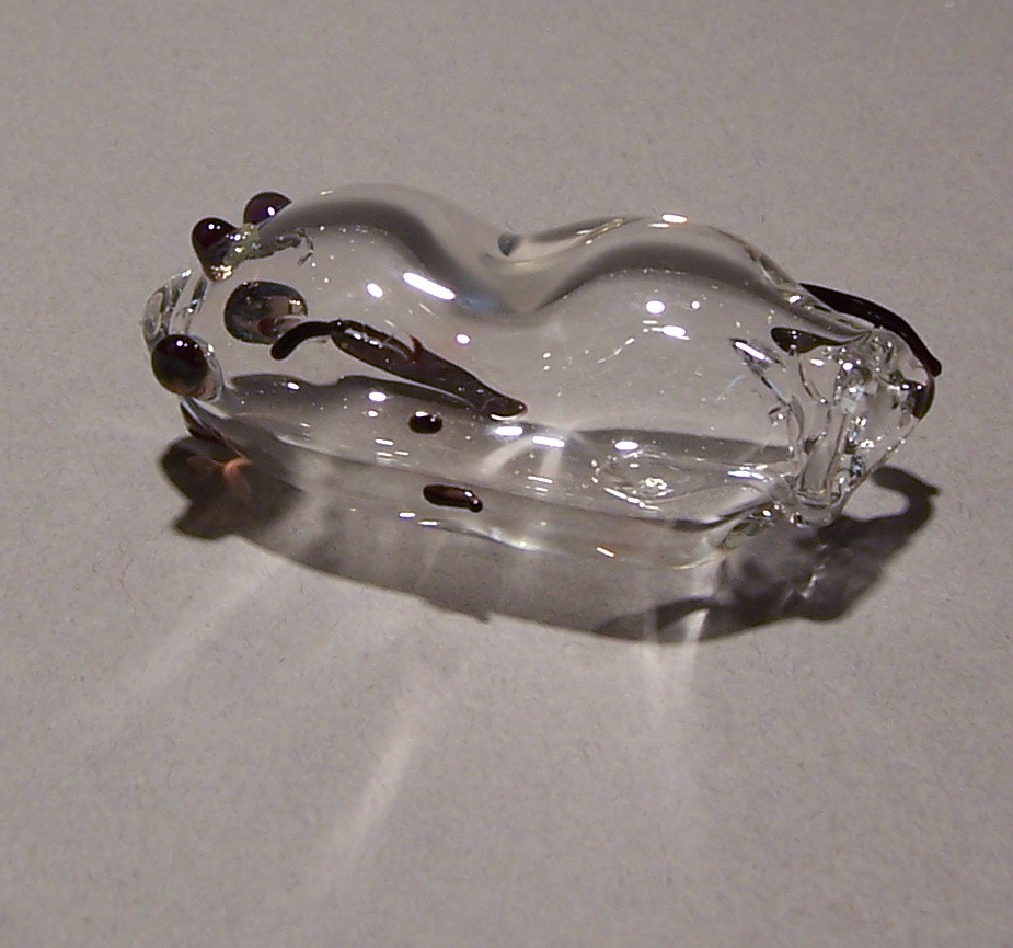
I did better at making these when I was taking the borosilicate class in February. Somehow I forgot most of what I learned in four months. Some of them are rather amorphous.
Sep 28
I did better at making these when I was taking the borosilicate class in February. Somehow I forgot most of what I learned in four months. Some of them are rather amorphous.
Sep 26
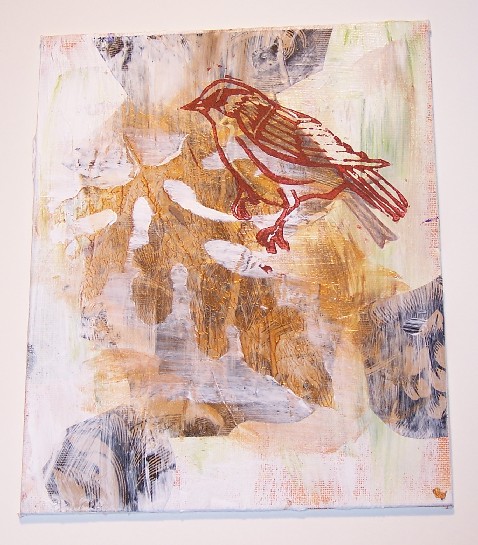
The black-and-brown woodcut pattern is from wrapping paper from my favorite stationary store in Prescott. I did the outline of the leaf by gessoing over a pressed watermelon leaf. The sparrow linocut I did myself. In addition to learning about what looks good and what doesn’t, I’ve had to learn how to photograph 2-D pieces. …
Sep 20
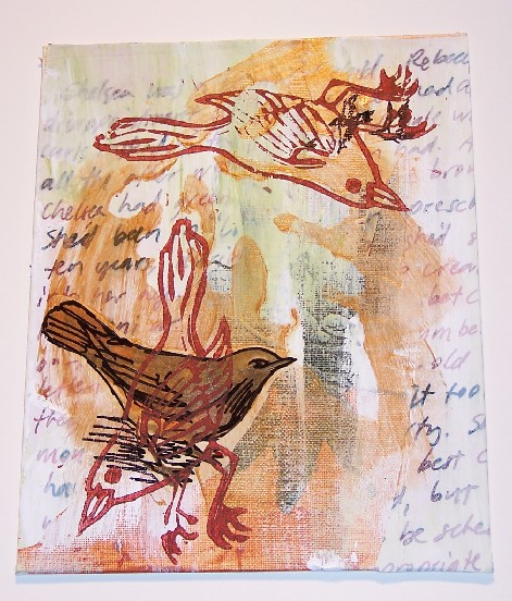
I’ve been trying my hand at collage lately. I’m so impressed by the beauty of a lot of the collage artists I’ve seen, impressed enough that I want to duplicate everything I see. This is my first time using gesso for anything other than priming a canvas. I saw the technique in Cloth Paper Scissors, …
Sep 18
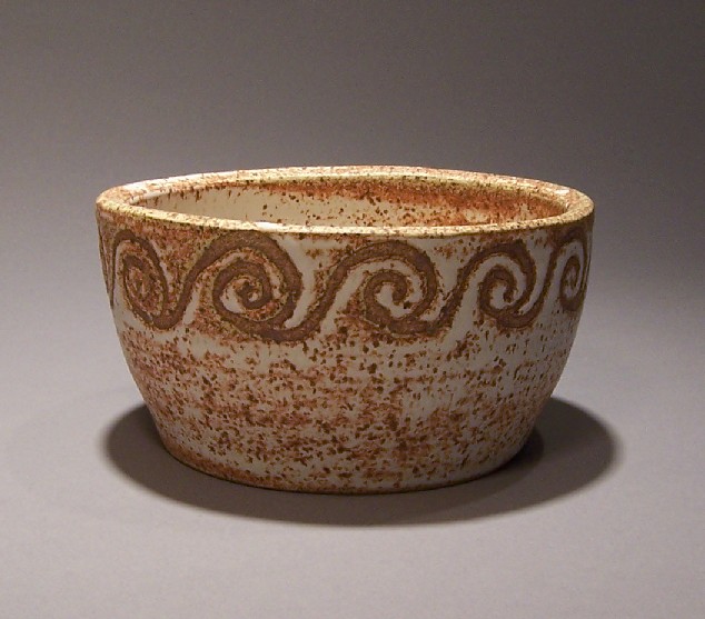
The design was made by painting wax resist before dipping the pot in glaze. It’s a technique I’ve used frequently at the Empty Bowls bowlmaking-sessions.
Sep 10
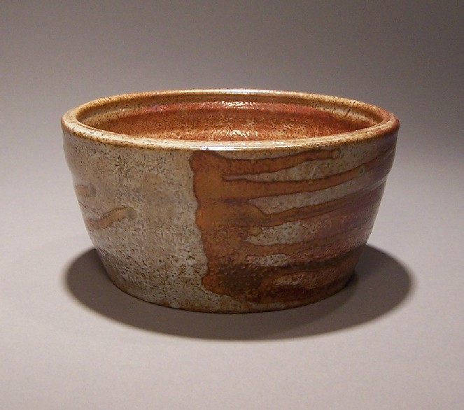
I made the horizontal lines by dripping the overglaze on the side while the pot was tipped. I’d made one like this before, but foolishly gave it away. Of course, now I have the pots and nothing to put in them. I think I’ll put cactus in them, or something else that does well with …