• Home
  • About Kater Cheek
  • Writing Resume
  • Contact

Kater’s Art

artblog and writing resume

Categories

  • 48 Birds
  • alternart
  • Art Journal
  • books
  • Clarion
  • collage
  • doll/faeries
  • drawing
  • Glass
  • henna
  • Postcard
  • pottery
  • Printmaking
  • shrine
  • smiley ball
  • Tiles
  • Uncategorized
  • wood

Books!

  • Dayrunner
  • Seeing Things
  • Treemaker

My other sites

  • Occasionally Offensive

Meta

  • Log in
  • Entries RSS
  • Comments RSS
  • WordPress.org

Celadon Book

October 29th, 2008 by Kater

celadon-book-front.jpgceladon-book-back.jpg

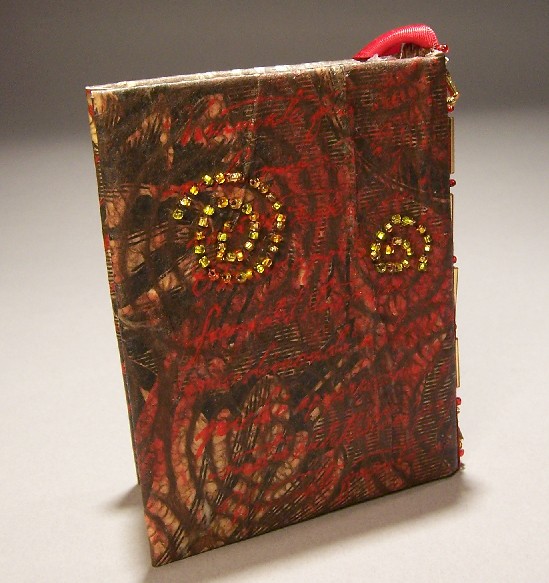
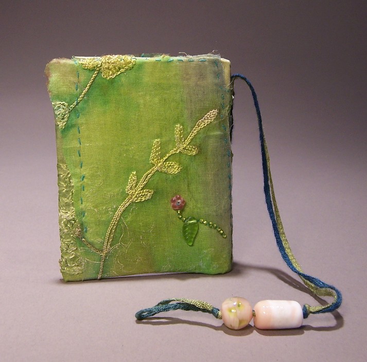
I wanted to do a different cover for this one, one that was almost entirely cloth.  The trouble I always have is how to adhere it.  Gluing it tends to eliminate the soft texture, whereas sewing it means loose edges and threads.  I comprimised and used fusible seam tape left over from the curtains I got at Ikea.  I used over a yard of the tape before I was done fusing all the layers of green cloth to each other, and even then, there were loose edges. 

I had hoped to superimpose a texture over top using gold interference acrylic and a rubber stamp, but the directions in the magazines that indicate this is possible were probably writing for people whose houses have higher humidity.  Not only did the acrylic barely imprint at all on the cloth, but it nearly ruined my stamp. 

To fix the loose edges, I sewed the turquoise line of stitching wherever I thought it would be a problem.  I borrowed the beads from my daughter, who had the exact shade of green I wanted.  I also sewed on the woven cord/bookmark.  By now I’d already decided who I was making this for.  I looked through the beads I’d made, and found these pink ones, which, like the title and hue of the cloth, made me think of her writing.  I used pink flowers at the ends of the green vines to coordinate it.

I had some issues with this cover as well.  I had the problem with the end papers in that I tried to use just half a sheet, covering only the inside of the cover and not the seam, but it looked terrible.  Then I scrounged around for some paper that would match, and while I couldn’t find anything as nice as the handmade pale green paper with plant fibers in it, the metallic hunter green paper with the fabric-feel worked acceptably.  After I’d attached it, unfortunately, it became apparent that the cover boards weren’t perfectly even.  Sometimes the signature block itself ends up not completely square, especially when I rush to finish.

The other issue with the cover is an issue that I’ve had with all my cloth covers: When the edge of the cloth is near the edge of the board, it looks messy, as though the hem has come loose.  Sometimes I can fix this with my heat gun, but in this case the fabric wasn’t synthetic, so it just scorched instead of melting.  Part of the problem is that cloth doesn’t glue as well as paper does, especially not slick satiny cloth.  It’s still sturdy, and still functional, but it looks more rough-hewn than I would like.

Posted in books | 3 Comments

Nopal Tile

October 28th, 2008 by Kater

nopal-tile-web.jpg

Nopales (Prickly pear cactus) and Agaves are among my favorite botanical subjects.  Oaks and blackberry brambles are the others, but those are harder to find. The design was made freehand with slip trailed from a jacquard bottle, like the others.  After the fact, I found that it’s much easier to get the look I wanted simply by using three dimensional low-fired glaze called ‘French Expressions’ from Duncan. 

Posted in Tiles | No Comments

Colored Swallow Book

October 23rd, 2008 by Kater

color-swallow-book-back.jpgcolored-swallow-book-front.jpg

I made this cover by collaging different colored papers,t hen layering over it with painted paper towel, all adhered together with acrylic medium.  After I had a bright background, I printed on it with block printing ink and my favorite swallow linoblock that I’ve been using for just about everything.  It doesn’t have end papers, because when I was gluing the cover down, the first and last sheets of the book got stuck to the cover. 

Posted in books | No Comments

Blackberry Tile

October 19th, 2008 by Kater

blackberry-tile-sm.jpg

This is one of the tiles I have up at my etsy shop.  I did it about two years ago, along with most of my other tiles.  It took a long time to make these tiles, because I had to pound the clay flat by hand, using a special mallet.  I got pretty good at it. I could have rolled them, but they warp much less when they’re pounded than when they’re rolled.  After I cut it to shape, I drew the design freehand with a jacquard bottle filled with slip.  Then I fired it, painted on the low-fired glazes, and fired it again.  This was back when my kiln was still working.

Posted in Tiles | No Comments

Five of Cups Book

October 16th, 2008 by Kater

five-cups-book-cover.jpgfive-cups-book-back.jpgfive-cups-book-endpapers.jpg

This book cover was one of those that seemed like it wasn’t going well up until the point it was finished.  Sometimes failure makes for a better outcome, as I keep trying new things, adding more and more until the end result works. 

The inside of the book is one of my handmade book blanks, again with 50lb sketch paper sewn in six signatures of six leaves each, with linen tape and thread.  The boards are matboard.

For the cover (my favorite part) I started with a piece of muslin, to which I adhered a sheet of printed brown wrapping paper, using acrylic medium.  I printed over this with my swallow linoblock.  It looked okay but not clear, and more importantly, not enough of a focal point, so I put one of the Morgan Greer tarot cards on the cover. (Five of cups, symbolizes a minor setback.)  The problem was that the acrylic medium made the water-soluble blockprinting ink smear. 

I didn’t want the card to be the entire cover. I decided to tone it down by adhering some brown art paper with fibers in spiral designs.  The problem with this is that it obscured the art of the card entirely, so I brought it up again with ink and then acrylic.  I printed over it again with rubber stamp of Italian script to bring out the red of the spilled wine.

By now it had a gothic/mideval feel to it, and I wanted to enhance that, so I used a red ribbon with one of the glass beads I made in lampworking class as a bookmark.  I used some more beadwork on the spine as decoration and to fasten the ribbon to the cover.  It didn’t look quite spiffy enough on the back cover, so I did some beadworking in gold beads to tie the color scheme together.  This one took much longer than the other two books I was making at the same time, but I liked it best of all.

I plan on sending it to one of my fellow clarionites as a surprise. I hope to eventually make books for all of them.

Posted in books | 3 Comments

« Previous Entries

 
Wordpress Themes by and Website Templates by Blogcut