
This book cover was one of those that seemed like it wasn’t going well up until the point it was finished. Sometimes failure makes for a better outcome, as I keep trying new things, adding more and more until the end result works.Â
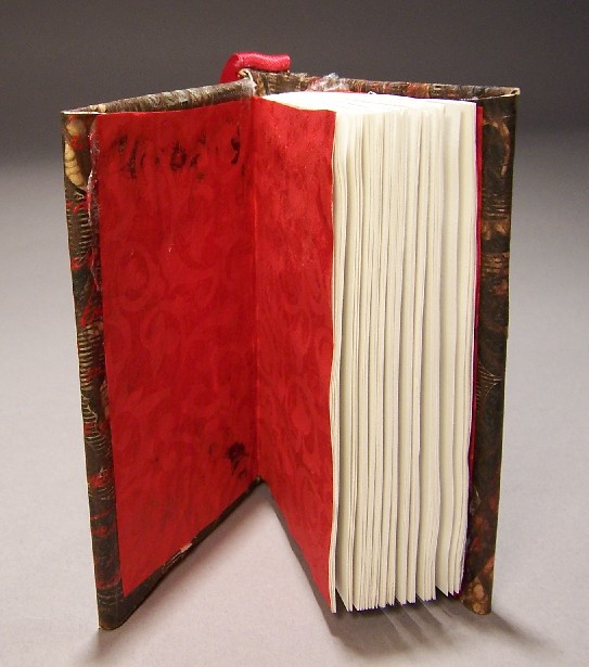
The inside of the book is one of my handmade book blanks, again with 50lb sketch paper sewn in six signatures of six leaves each, with linen tape and thread. The boards are matboard.
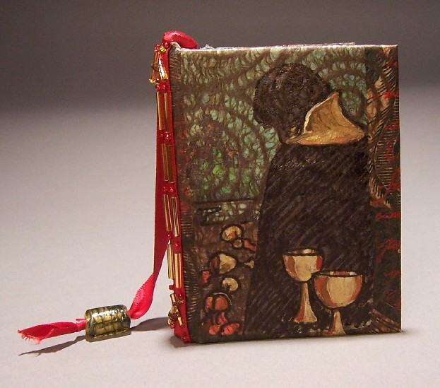
For the cover (my favorite part) I started with a piece of muslin, to which I adhered a sheet of printed brown wrapping paper, using acrylic medium. I printed over this with my swallow linoblock. It looked okay but not clear, and more importantly, not enough of a focal point, so I put one of the Morgan Greer tarot cards on the cover. (Five of cups, symbolizes a minor setback.) The problem was that the acrylic medium made the water-soluble blockprinting ink smear.Â
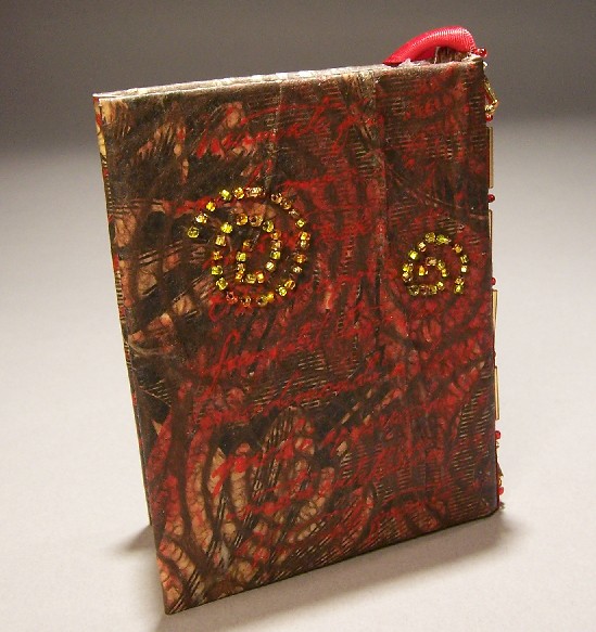
I didn’t want the card to be the entire cover. I decided to tone it down by adhering some brown art paper with fibers in spiral designs. The problem with this is that it obscured the art of the card entirely, so I brought it up again with ink and then acrylic. I printed over it again with rubber stamp of Italian script to bring out the red of the spilled wine.
By now it had a gothic/mideval feel to it, and I wanted to enhance that, so I used a red ribbon with one of the glass beads I made in lampworking class as a bookmark. I used some more beadwork on the spine as decoration and to fasten the ribbon to the cover. It didn’t look quite spiffy enough on the back cover, so I did some beadworking in gold beads to tie the color scheme together. This one took much longer than the other two books I was making at the same time, but I liked it best of all.
I plan on sending it to one of my fellow clarionites as a surprise. I hope to eventually make books for all of them.
2 comments
1 ping
I really like the strength of the spirals in this. Is that the fibers which given them the crackled look?
Author
Yes. I didn’t see it as being crackled looking before, but it’s the fibers that make it look that way. I don’t know the name of that sort of paper, but it’s a specific type. It’s usually white, and expensive.
[…] put together a diary about its construction, here. You can see more of her stuff […]