• Home
  • About Catherine Cheek
  • Writing Resume

Kater’s Art

artblog and writing resume

Category:

  • 48 Birds
  • alternart
  • Art Journal
  • books
  • collage
  • doll/faeries
  • drawing
  • Glass
  • henna
  • pottery
  • Printmaking
  • shrine
  • smiley ball
  • Tiles
  • Uncategorized
  • wood

Archives:

  • July 2010
  • June 2010
  • May 2010
  • April 2010
  • March 2010
  • February 2010
  • January 2010
  • December 2009
  • November 2009
  • October 2009
  • September 2009
  • August 2009
  • July 2009
  • June 2009
  • May 2009
  • April 2009
  • March 2009
  • February 2009
  • January 2009
  • December 2008
  • November 2008
  • October 2008
  • September 2008
  • August 2008
  • July 2008
  • June 2008
  • May 2008
  • April 2008
  • March 2008
  • February 2008
  • January 2008
  • December 2007
  • November 2007
  • October 2007
  • September 2007
  • August 2007

Blogroll:

  • Amalia Fisch
  • Black Wren Morris
  • Bridget Cherie Harper
  • Coop De Grace
  • Ecstatic Days
  • Endicott Studios
  • Glass Maze
  • Jerome Stueart
  • Keyan Bowes
  • Kolby
  • Livejournal
  • Lucy Snyder
  • My Etsy Shop-Scarletcrow
  • Nick Wolven
  • The Blatantly Obvious

Meta:

  • RSS
  • Comments RSS
  • Valid XHTML
  • XFN

Jerome’s Landscape

January 31st, 2009 by admin

Jerome’s Landscape

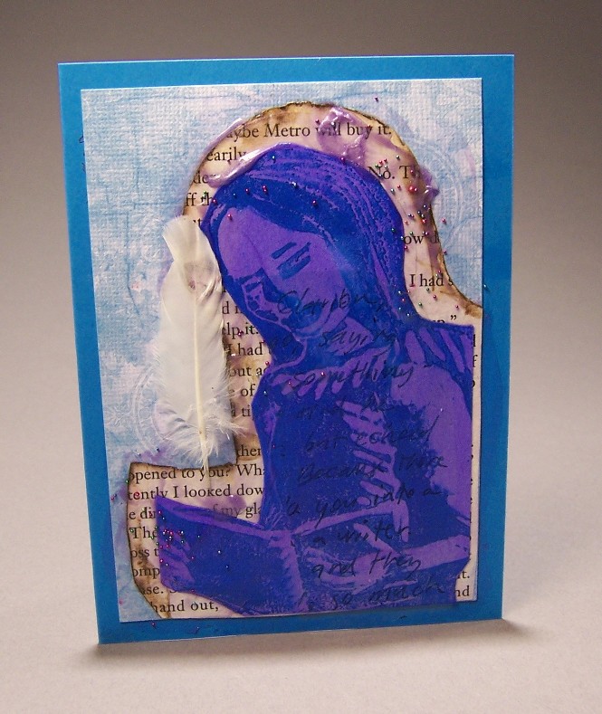
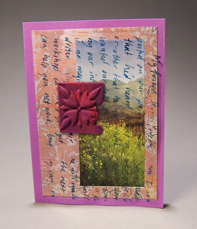
I was originally going to use one of the etched copper embellishments I made for this, but decided against it because the metal would be too heavy to mail. When I mail letters, I tend to cut extra sheets so I can add a lot more text than the stationary-makers think a person needs, and they push the edges of allowed first class weight.

I’d saved sheets from a magazine that had nice landscapes in the background. This was from some kind of ad, I think.  I cut off the part with the people and adhered it to the scrapbook paper background.  I’d already decided to use the polymer clay embellishment (I made it when I made the other things for Jessica’s jewelry box).

I knew for this one that I wanted to have text on it. What I like best of all is hand-written dip pen on paper.  Of course, hand written dip pens are tempramental, and won’t write on glossy paper, unsized paper, or anything coated with acrylic paint: therefore, no collage work. I’d bought these laser decal transfer sheets when I bought the printable temporary tattoo paper for my practical joke last year.

I had known I wanted to do something like this, so the last time I wrote Jessica (different Jessica) I scanned a couple sheets of my letter to her.  This particular paragraph talks about my friend Jerome, and about a question he posted on our private forum asking for advice about a writing workshop.

Posted in collage | No Comments

Haloed Blue Reader Card

January 28th, 2009 by admin

Haloed Blue Reader

I’d made the linoblock of a woman reading for another birthday card for Jane, and the print was still in the pack of cards. I cut it out and placed it experimentally on the blue scrapbooking paper background.  It wanted some kind of outline, and I love the idea of using text, so I took a piece of a novel that I’d altered and cut around it.

The edge was too harsh, so I softened it by burning it with a woodburner.  I wanted to adhere it and also tint it blue or violet to match the rest, so I added some violet pearl acrylic to the tranparent gel medium.  It’s still not quite as tinted as I would like, but I jsut left it.  I also added some mardi-gras colored glass beads to the pitcute while  it was still wet. You can’t see them very well in the photo.  I also added the dove feather, just because I had it lying around.

I had already decided to make a laser decal of writing for another card, so I took the scraps of that and laid it over this, just because the colors didn’t clash.  You can hardly tell it’s a decal. It looks a little like I drew directly over the linoblock print (except I can’t make it look good just by drawing. I freeze up and don’t know what to write, and my handwriting doesn’t look natural.)

Posted in collage | 1 Comment

Happy Birthday Jane

January 25th, 2009 by admin

Jane’s Face CardJane’s face card

Jane’s birthday was the impetus behind all this card-making.  I wanted to make a birthday card for her that was really special.  This particular card was the hardest to make, as it didn’t seem to turn out the way I wanted it to.

After I chose the card color and the background scrapbook paper, I had established the theme of red and gold.  Next I took a piece of the background paper and drew a cake and candles on it.  I’ve seen hand-made drawings used in collage to good effect before, but not this time. I just couldn’t make it work. I tried adding gold paint to it, but even that didn’t help. The problem, I decided, was that the syncronicity between the papers was too obvious. No matter what I put in between them, the fact that I’d used the same paper twice stood out.  I tried using gold paper behind it, but even that didn’t help, so I ditched it (and eventually used it in the middle.)

My next try was to draw the same birthday cake on a piece of brass with a sharpie.  It looked terrible. I ditched it.

So I cut a piece of the orange art paper and pasted it, then picked up another piece of the red handmade paper and tried to decide how I could make it work. I’d had a little tube of rub-n-buff that I bought a year ago and have never used.  Part of this whole card-making exercise was about experimenting with new materials, so I opened it up. It smells delightfully toxic, like turpentine or spray paint. It also made a rather organic-looking smear of gold on the handmade paper.

Once the gold was on there, the gold paper worked beautifully, so I cut it out.  I was going to try to paint one of my fimo faces with bronze or iron paint, but when I saw a red one in my scraps drawer, I decided to make less work and just use that.  The acrylic gel (or the brush) had some blue in it, probably from the blue linoblock ink on the haloed blue reader card.  I’m not fond of the blue underneath the face, but it doesn’t look terrible.

Posted in collage | No Comments

Kuchi Red-Violet book

January 22nd, 2009 by admin

kuchi-red-violet.jpgkuchi-red-violet-back.jpgkuchi-red-violet-endpapers.jpg

This is the fourth of a series of four books I did simultaneously in which I used the same rainbow tie-dye fabric as a base. For this book, there wasn’t any green and hardly any blue in the piece of cloth I had, which I liked very much. 

The front cover and the back are nearly identical, except for the variation of cloth hue.  I appliqued the same violet tie-dye cotton (from another of my daughter’s skirts) onto it in a square, then a square of copper colored metallic material that had been used to wrap flowers.  On top of that was some trimmed origami paper, then a square of felted wool from a sweater that I adored until the moths ate it (and it got washed–hence, felted.) 

I sewed the jewelry embellishments onto the felt before gluing it, and sewed the strip of jewelry onto the spine before gluing the cloth to paper.  For this book, the Smoke-Key book, and the ‘Something’s in the Kitchen’ books, I used pieces of the manuscript of a story I just wrote. You can’t see the text, but I know it’s there.

I like this book so much, I might keep it.

I’d like to thank Mary Swallow again, for giving me the nice end papers.

Posted in books | 2 Comments

Something’s in the Kitchen

January 18th, 2009 by admin

something-kitchen-front.jpgsomething-kitchen-back.jpgsomething-kitchen-endpaper.jpg

This is the third in the series of four books for which I used rainbowy tie-dyed fabric as the base.  For this one I fused together strips of novelty cotton prints, then stitched in a crosswise pattern to keep them secure. 

I knew I wanted some kind of text over the fabric, but I couldn’t decide what to write.  I obsessed about it. Nothing seemed right. I mean, if it’s going to be immortalized in a work of art, it should be profound, right?  In the end, I just stopped worrying about it and wrote the first piece of drivel that came to my head.

Something’s in the kitchen
Stirring up the cats
Making a Soufflee of
The weevils and the rats
A wicked little creature
Not everyone’s delight
It has all the makings of
A delicious, wicked night.

After I came up with the poem, a skull with crossed fork and spoon seemed to be the only appropriate cover art.  I cut the skull out of black drawing paper, and the utensils out of silver paper.

I don’t think I’ll do this many layers of cloth again.  It was way too thick, and very difficult to bend around the head and foot because of the bulk.

Posted in books | 1 Comment

« Previous Entries

 
Wordpress Themes by and Website Templates by Blogcut