• Home
  • About Catherine Cheek
  • Writing Resume

Kater’s Art

artblog and writing resume

Category:

  • 48 Birds
  • alternart
  • Art Journal
  • books
  • collage
  • doll/faeries
  • drawing
  • Glass
  • henna
  • pottery
  • Printmaking
  • shrine
  • smiley ball
  • Tiles
  • Uncategorized
  • wood

Archives:

  • July 2010
  • June 2010
  • May 2010
  • April 2010
  • March 2010
  • February 2010
  • January 2010
  • December 2009
  • November 2009
  • October 2009
  • September 2009
  • August 2009
  • July 2009
  • June 2009
  • May 2009
  • April 2009
  • March 2009
  • February 2009
  • January 2009
  • December 2008
  • November 2008
  • October 2008
  • September 2008
  • August 2008
  • July 2008
  • June 2008
  • May 2008
  • April 2008
  • March 2008
  • February 2008
  • January 2008
  • December 2007
  • November 2007
  • October 2007
  • September 2007
  • August 2007

Blogroll:

  • Amalia Fisch
  • Black Wren Morris
  • Bridget Cherie Harper
  • Coop De Grace
  • Ecstatic Days
  • Endicott Studios
  • Glass Maze
  • Jerome Stueart
  • Keyan Bowes
  • Kolby
  • Livejournal
  • Lucy Snyder
  • My Etsy Shop-Scarletcrow
  • Nick Wolven
  • The Blatantly Obvious

Meta:

  • RSS
  • Comments RSS
  • Valid XHTML
  • XFN

48 Birds #8: The Crow and the Golden Pear

April 30th, 2009 by admin

crow-and-pear.jpg

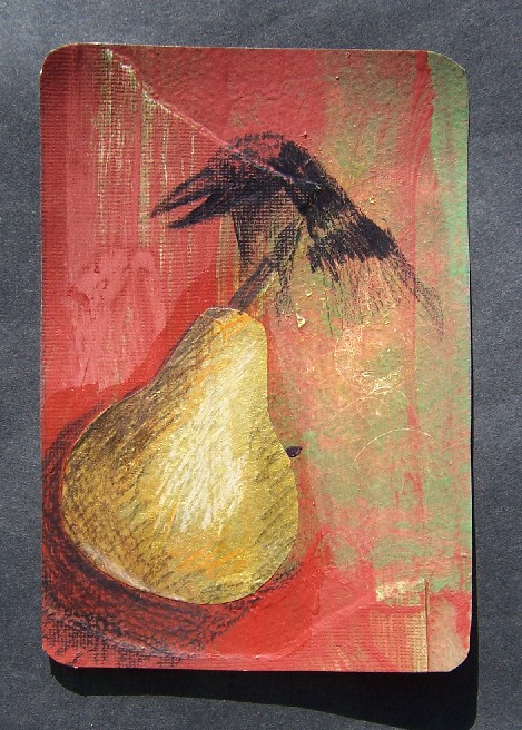
For this piece, I also began with a gesso resist under a wash of acrylic, using a rubber stamp of a pear.  You can still barely see the imprint of the pear just under the crow’s shoulder.  After pasting on scraps of greenish textured paper and repeating washes of red-iron-oxide colored paint, I decided it was time to stop dicking around with the background and make some kind of a focal point.

I wanted to repeat the pear motif, while adding a little elegance to the piece, so I used golden joss paper.  Joss paper is the fake money that Chinese people burn for the dead at New Year’s.  It’s thin, cheap, and bleeds like crazy, so it’s good for certain kinds of collage. I folded it in half and trimmed it into the pear shape, then pasted it onto the paper with acrylic medium. The acrylic kind of made it shiny around it in a halo, but it was supposed to be matte, so I don’t know why.

My pieces have been hankering for a little more realism.  Acrylic would have worked better, but the clean up is such a nuisance that I decided to resort to colored pencils despite the way they exaggerate the texture.   With a little shading, the pear looked much more like a piece of fruit and a lot less like a pear-shaped piece of joss paper.

Now for the bird.  I’d cut some raven linoblocks, but again, getting out the acrylic seemed like a huge nuisance, so instead I just drew a crow’s head using the black colored pencil.

Posted in 48 Birds | No Comments

Smiley Ball 2

April 24th, 2009 by admin

smiley-balls-2b.jpgsmiley-balls-2.jpg

Posted in smiley ball | 1 Comment

48 Birds #7: Half Flight

April 21st, 2009 by admin

half-flight.jpgÂ

I started out with the gesso resist. I used a greenish wash in the background, with a Victorian bookplate design stamp providing the resist. Since I almost always stick to blue+orange as my color theme, I decided to vary it and go with a sage green+red iron oxide color theme.  I did a wash of reddish paint over the green.  I had some paper that matched the color scheme, so I pasted bits of it all over, then let it dry.  Then I did a wash of titan buff over that, trying to make the paper look like it wasn’t just bits of paper glued down randomly.

By now it looked pretty bad.  Â

I’d done a technique earlier to make paint look like it was peeling, and decided that if I ruined this it wasn’t like I was throwing away a masterpiece. First you smear petroleum jelly haphazardly over the piece. Then you paint a solid wash of color over the whole thing and let it all dry.  (The letting-it-dry stages are why these pieces can take me a week or more to finish, and why I usually do two to four simultaneously.) When the paint is dried, you rub off the petroleum jelly, and the paint flakes off like it’s old.  It also makes the surface kind of greasy, which is partly why I did the gesso in the next step.

I had an idea of a woman with a box where her heart was supposed to be, and a bird flying in the box. The original name of this post was going to be “The Box-Shaped Heart,” a sort of pun on the title of the Nirvana song.  In my head it was really beautiful. You’ll have to take my word for it.Â

I didn’t want to try to paint something directly over the background, because my crappy paints can’t handle it, so I first painted it with gesso. The right side got a little messed up, but I told myself it didn’t matter, that I wasn’t going for imperfect.

When that gesso dried, I tried to sand it.  It didn’t get as smooth as I’d hoped, so instead of using colored pencils, I just mixed up some acrylic and asked myself “how hard can it be?”

I do wonder if I’ll ever get over my aversion to acrylic.  The colors just don’t seem to mix like I wanted. The highlights don’t look natural.  With watercolor, if you want the same shade a little lighter, you just mix water. And if it’s not dark enough, you just add a little more paint. With acrylic, when you add white, it gets cartoony. This is what I dislike most about acrylics most of the time when I see paintings in galleries: the colors just aren’t true.

Enough complaining. I got the left side to look right, but the right side’s outline was pre-determined by the placement of the gesso, and there was no way I could make an arm look that fat and have it natural, so I made it a wing instead, inspired by Shweta Narayan’s poem “Half Flight.”  By then I realized that if the figure had half a wing, it wasn’t going to be a girl, it had to be a boy, like the young prince in the fairy tale. So I left the face as it was, half shadowed and indistinct.

I wanted a realistic bird in the box.  I can draw realistic birds, especially if I have a thousand Google images to inspire me. So I drew a sketch of a flying tern, and then a smaller pencil drawing in exactly the right size.  I cut it out and placed it over the picture.  It didn’t work at all.  I taped the drawing into my sketchbook and started over.Â

I had a piece of a magazine that thankfully at least matched the color scheme.  I tore off a piece that looked big enough and turned it over, sketching until I had the outline of a bird. Then I cut it out, taking extra care to get some detail around the lee edge of the wing.  After I glued it onto the piece, it didn’t stand out enough, so I touched it up with black and titan buff acrylic washes.  Time to stick a fork in it and call it done.

All learning experiences, right?

Posted in 48 Birds | No Comments

Smiley Ball 1

April 14th, 2009 by admin

smiley-balls-1b.jpgsmiley-balls-1.jpgI’m going to use pictures of my smiley balls as filler when I don’t have another 48 birds or other 2D art to share.  They’re high fired, hand built spheres, and I made ten of them. They are in the garden now, making me smile whenever I see them.  I think I would like to make more.

Posted in smiley ball | 4 Comments

48 Birds #6 Who Has Fled the Garden?

April 10th, 2009 by admin

who-has-fled-the-garden.jpg 

I started out with a gesso resist technique, using a wash of light brown and a stamped gesso design.  Honestly I can’t remember how it looked, except that I made the mistake of thinking I’d draw a picture on the background and use it as a springboard for another design.

There’s a school of thought that the only kind of 2D one should strive for is photo-realism.  As much as I admire realistic art, I didn’t want to devote my art to trying to duplicate in many years and many hours of practice what a camera can do in 1/15th of a second, so I shifted my focus to 3D, but I still have the internal inistence on perfection.  Always I have in my head what the real thing looks like, and the drawing is measured up to that image.   I feel exposed when I draw and paint: I was taught to draw as realistically as possible, and I can’t help but try, and then I fail. 

Part of the goal of this project, and my new focus on mixed media in general, is to learn to be more comfortable with chaos, with representation that’s not totally faithful. Non-realistic drawing and painting, like belly fat, looks endearing when it’s someone else’s, but I can’t (yet) tolerate it on myself.  Considering how I cringed when I saw my sharpie-cartoon sketch of a songbird, I have a long way to go.  48 birds might not be enough.

I took a piece of orange-and-gold joss paper and adhered it over the support, which partially obscured the drawing I was so ashamed of.  It didn’t obscure it completely, but I had a tube of liquitex acrylic, which is much, much better than the little jars of Apple Barrel and Ceramcoat you get at Michael’s. 

I didn’t think I’d be able to paint a realistic looking wing, but I didn’t have to.  I’d drawn one on a piece of cardstock earlier, and cut it out, so I had a stencil.  It worked so well that I decided to paint a little bird flying in the sky.  As with most my acrylic attempts, it turned out like crap.  You couldn’t even tell it was a bird.

I’d been given these little memory-game cards in a Christmas card from our Czech exchange student.  My self-imposed prohibition against using others’ art draws the line at cards (Tarot, playing, Mexican lottery, etc.)  So I chose this one and pasted it over the bird-shaped blemish.  I tapped a little gold mica powder into the acrylic gel medium so that it had the same sheen as the gold wash over the joss paper and the gold paint in the wing.

Then I had an idea.  Would pen and ink work over acrylic? I didn’t think so, but it was matte medium, and I’d sanded it smooth, so I decided to try anyway.  Now I know.  Sometimes you can use pen and ink over acrylic.  The words came out of the somewhat biblical imagery of the card, and from the double-meaning of the word “fled”.

Posted in 48 Birds | 1 Comment

« Previous Entries

 
Wordpress Themes by and Website Templates by Blogcut