
I had read about some gesso resist techniques and wanted to try them. The author, whose article appeared in a magazine called “Apprentice Building Blocks” from Somerset, neglected to mention whether one had to paint the background with paint before doing the gesso resist, or whether you were to just paint the gesso on plain paper. So I tried both.
Since I had the gesso out anyway, I layered gesso over this support and used a stamp to impress a sort of Italianate boss. After it dried, I did a wash of gold paint, and then another wash of red iron oxide paint. It looked fantastic, and I was sure this was going to be an excellent piece. However, I managed to ruin it.
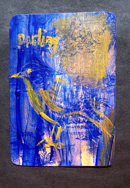
My color themes gravitate towards blue+orange. I’m not sure why. Of all the opposite colors, blue/orange is my favorite pair. So natrually, I decided to add some blue to this. I had some tissuepaper with a toile design on it, so I tore a sheet off and pasted it on. This instantly turned my favorite promising start into something that didn’t work.
Next, I did a wash of blue over it. This made it even worse, obscuring what little remained of the design in the gesso. While the paint was still wet, I pressed my sparrow linoblock into it. You could barely see the sparrow, but it was a start.
What it needed, I decided, were some words. Yellow words, stamped with one of my myriad stamp sets. So I got out some acrylic paint and mixed up a good shade, then spread it out flat so I could stamp in it. This technique is mentioned in nearly every magazine about collage and mixed media I’ve ever seen–and it never works! Not here, at least, with our low humidity. All it does is make the stamps dirty. I’ve been able to make it work if I mix it with acrylic gel retarder, but that’s kind of a nuisance step.
Here’s what I like about acrylic: It sticks to just about everything, which means you can use it to paint over mixed-media surfaces.
Here’s what I dislike about acrylic: everything else.
I know some people are able to make fabulous paintings with acrylic, but since my painting focus was always on watercolor, I find that when I paint with acrylic I feel like I’m painting with q-tips and toothpaste. I just don’t have the control I’m used to, and without control, I can’t make something that looks realistic. Often, I can’t even make anything that looks good. More on this later.
Since the stamps were a dismal failure, I started to scratch the letters through the top layer of paint instead. I have a blade I bought for scraffito, but it won’t wedge into my pen-nib holder far enough and the blade wobbles. I tried a different scraffito tool, but it was too sharp and just cut the paper all the way through. Finally I just dipped a brush in the gold/yellow paint and wrote “Darling”. I had a whole poem in mind, but the letting looked so crappy that I gave it up.
I used the rest of the yellow to highlight the sparrow and to bring out some of the boss design, then stuck a fork in it and called it done. I’m not terribly proud of this, but it was a learning experience. It’s all a learning experience.
1 comment
More like a bluebird now…