
I started out with a gesso resist technique, using a wash of light brown and a stamped gesso design. Honestly I can’t remember how it looked, except that I made the mistake of thinking I’d draw a picture on the background and use it as a springboard for another design.
There’s a school of thought that the only kind of 2D one should strive for is photo-realism. As much as I admire realistic art, I didn’t want to devote my art to trying to duplicate in many years and many hours of practice what a camera can do in 1/15th of a second, so I shifted my focus to 3D, but I still have the internal inistence on perfection. Always I have in my head what the real thing looks like, and the drawing is measured up to that image. I feel exposed when I draw and paint: I was taught to draw as realistically as possible, and I can’t help but try, and then I fail.
Part of the goal of this project, and my new focus on mixed media in general, is to learn to be more comfortable with chaos, with representation that’s not totally faithful. Non-realistic drawing and painting, like belly fat, looks endearing when it’s someone else’s, but I can’t (yet) tolerate it on myself. Considering how I cringed when I saw my sharpie-cartoon sketch of a songbird, I have a long way to go. 48 birds might not be enough.
I took a piece of orange-and-gold joss paper and adhered it over the support, which partially obscured the drawing I was so ashamed of. It didn’t obscure it completely, but I had a tube of liquitex acrylic, which is much, much better than the little jars of Apple Barrel and Ceramcoat you get at Michael’s.
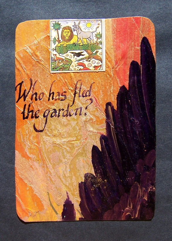
I didn’t think I’d be able to paint a realistic looking wing, but I didn’t have to. I’d drawn one on a piece of cardstock earlier, and cut it out, so I had a stencil. It worked so well that I decided to paint a little bird flying in the sky. As with most my acrylic attempts, it turned out like crap. You couldn’t even tell it was a bird.
I’d been given these little memory-game cards in a Christmas card from our Czech exchange student. My self-imposed prohibition against using others’ art draws the line at cards (Tarot, playing, Mexican lottery, etc.) So I chose this one and pasted it over the bird-shaped blemish. I tapped a little gold mica powder into the acrylic gel medium so that it had the same sheen as the gold wash over the joss paper and the gold paint in the wing.
Then I had an idea. Would pen and ink work over acrylic? I didn’t think so, but it was matte medium, and I’d sanded it smooth, so I decided to try anyway. Now I know. Sometimes you can use pen and ink over acrylic. The words came out of the somewhat biblical imagery of the card, and from the double-meaning of the word “fled”.
1 comment
Love the colors and the calligraphy, and the dark wing like a dark shadow and a subtle threat.
What double meaning of the word fled?