
I started out with the gesso resist. I used a greenish wash in the background, with a Victorian bookplate design stamp providing the resist. Since I almost always stick to blue+orange as my color theme, I decided to vary it and go with a sage green+red iron oxide color theme. I did a wash of reddish paint over the green. I had some paper that matched the color scheme, so I pasted bits of it all over, then let it dry. Then I did a wash of titan buff over that, trying to make the paper look like it wasn’t just bits of paper glued down randomly.
By now it looked pretty bad.
I’d done a technique earlier to make paint look like it was peeling, and decided that if I ruined this it wasn’t like I was throwing away a masterpiece. First you smear petroleum jelly haphazardly over the piece. Then you paint a solid wash of color over the whole thing and let it all dry. (The letting-it-dry stages are why these pieces can take me a week or more to finish, and why I usually do two to four simultaneously.) When the paint is dried, you rub off the petroleum jelly, and the paint flakes off like it’s old. It also makes the surface kind of greasy, which is partly why I did the gesso in the next step.
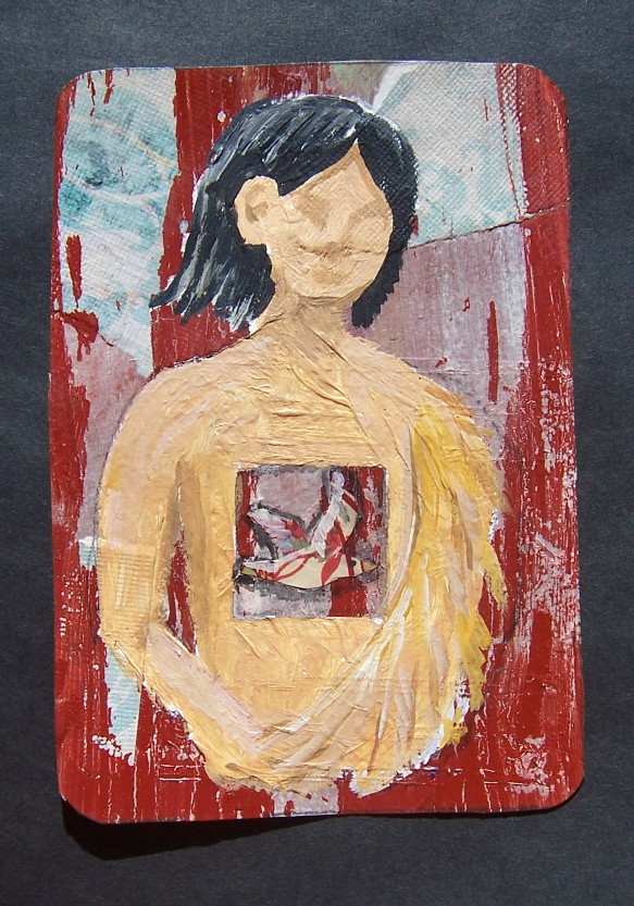
I had an idea of a woman with a box where her heart was supposed to be, and a bird flying in the box. The original name of this post was going to be “The Box-Shaped Heart,” a sort of pun on the title of the Nirvana song. In my head it was really beautiful. You’ll have to take my word for it.
I didn’t want to try to paint something directly over the background, because my crappy paints can’t handle it, so I first painted it with gesso. The right side got a little messed up, but I told myself it didn’t matter, that I wasn’t going for imperfect.
When that gesso dried, I tried to sand it. It didn’t get as smooth as I’d hoped, so instead of using colored pencils, I just mixed up some acrylic and asked myself “how hard can it be?”
I do wonder if I’ll ever get over my aversion to acrylic. The colors just don’t seem to mix like I wanted. The highlights don’t look natural. With watercolor, if you want the same shade a little lighter, you just mix water. And if it’s not dark enough, you just add a little more paint. With acrylic, when you add white, it gets cartoony. This is what I dislike most about acrylics most of the time when I see paintings in galleries: the colors just aren’t true.
Enough complaining. I got the left side to look right, but the right side’s outline was pre-determined by the placement of the gesso, and there was no way I could make an arm look that fat and have it natural, so I made it a wing instead, inspired by Shweta Narayan’s poem “Half Flight.” By then I realized that if the figure had half a wing, it wasn’t going to be a girl, it had to be a boy, like the young prince in the fairy tale. So I left the face as it was, half shadowed and indistinct.
I wanted a realistic bird in the box. I can draw realistic birds, especially if I have a thousand Google images to inspire me. So I drew a sketch of a flying tern, and then a smaller pencil drawing in exactly the right size. I cut it out and placed it over the picture. It didn’t work at all. I taped the drawing into my sketchbook and started over.
I had a piece of a magazine that thankfully at least matched the color scheme. I tore off a piece that looked big enough and turned it over, sketching until I had the outline of a bird. Then I cut it out, taking extra care to get some detail around the lee edge of the wing. After I glued it onto the piece, it didn’t stand out enough, so I touched it up with black and titan buff acrylic washes. Time to stick a fork in it and call it done.
All learning experiences, right?