
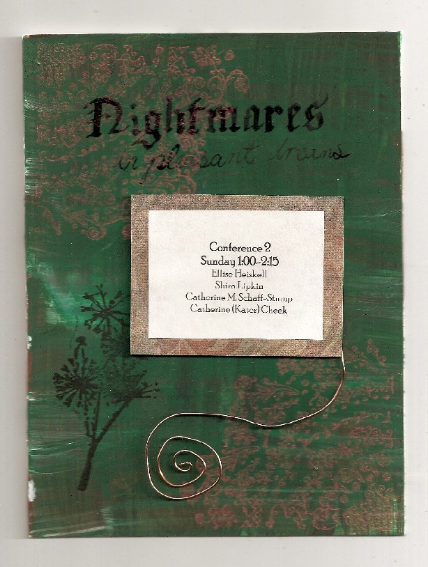
This is a sign I made for the reading at Wiscon that some fellow writers and I are going to do. I started with an old piece of matboard that I’d painted with several layers of acrylic. I believe it had a basecoat of reddish brown, followed by gesso and sage green, but it was so long ago that that might be wrong.Â
Using a wide nib calligraphy dip pen and some waterproof ink, I wrote “Nightmares” in an old fashioned calligraphic script. Underneath that, I wrote “In pleaant Dreams” in what was supposed to be copperplate but ended up looking like bad cursive. This was also in waterproof ink, but using a finer point pen.
I printed a stamp of the dandelion silhouettes with pigment ink, and while waiting for that to dry, mixed some interference red paint with gel retarder. The mehindi-type designs in the corners are also a purchased rubber stamp.
I’d printed out the information on porous block printing paper that I’d cut to 8 1/2 by 11 so that it would fit in the laser printer. After choosing the text that looked best, I cropped it to fit. The original plan was to tea-stain it, but that would have reduced the contrast–a major disadvantage on a functional piece. Instead I found some art paper that complimented the sage green and coppery tones of the background.
By adhering it to a rectangle of matboard, I ensured that the piece would have depth, and scans have a tendency to exaggerate depth in a piece.  I polished a piece of copper wire and bent it into a spiral, which created a second focal point and draws the eye to the most important part of the piece.
The reading itself should be very fun. If anyone who reads this is going to Wiscon over Memorial day, please stop by and see our reading.
1 comments
See you there!