
With this book I started once again with calico pasted to typing paper. The page was a sheet from an old manuscript, but the text is not visible. I tried to do a second print from the tree monoprint, but it didn’t take very well. I used an onion bag to put some texture on, painting through it, and put some random blotches of paint as well, but it didn’t look like it was going anywhere good.Â
In the past, laying painted paper towels over another surface has been great at producing a semi-translucent textural wash-type effect. I had a piece of paper towel that was the right color pattern, though in retrospect it would have been better to divide it into a single layer instead of using both plys. Â
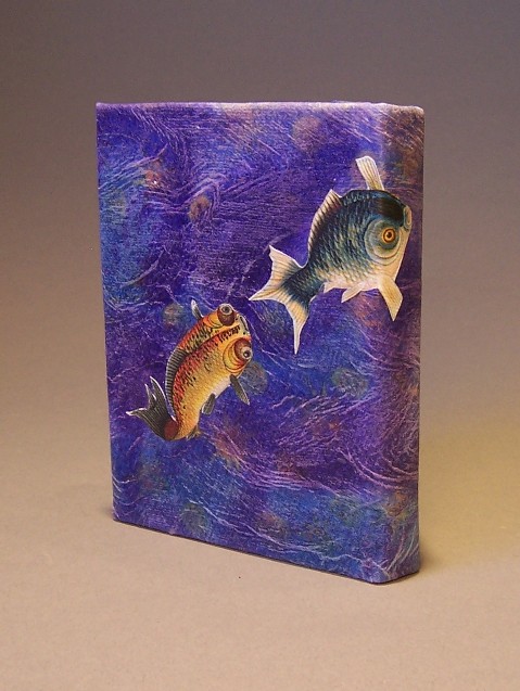
After pasting the towel down to the calico with acrylic medium, I took a toothbrush and rubbed it over the surface to enhance the texture. This wavy pattern in turn encouraged the fish motif. After it dried, I sanded it lightly, which brought out the texture and roughened the surface to make adhesion better.
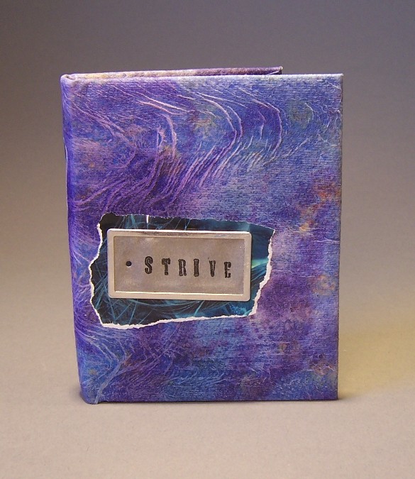
I had the tag left over from a sale on scrapbooking supplies, and wanted to put a quote on it. If I’d been able to fit it all, I would have liked to put the quote “the race does not always go to the swiftestâ€. For me, this piece is about perseverance—a trait writers must have if they are to succeed. Since that wouldn’t fit, I chose one word, “Strive†and stamped it on with pigment based ink. Again, I had to seal it with clear embossing powder to keep it from smearing.
To highlight the tag, I used a piece from an old movie poster. Bonus points if you can guess which one. In retrospect, it would have been nice to have an additional 3-D embellishment (like a small fish charm) above the tag, but by the time I’d realized that, it was too late to sew anything on.
Before I attached the cover to the inside of the book, the cover only had one fish (the orange one.)Â Once it was glued over the spine and fastened, it seemed a little empty, so I cut out another fish and let it wrap around the spine to connect front to back.
2 comments
LOVE IT!
Beautiful. This one comes together perfectly. Including the fish, which remind me of Boy’s Day carp as well as returning salmon swimming upstream.