• Home
  • About Catherine Cheek
  • Writing Resume

Kater’s Art

artblog and writing resume

Category:

  • 48 Birds
  • alternart
  • Art Journal
  • books
  • collage
  • doll/faeries
  • drawing
  • Glass
  • henna
  • pottery
  • Printmaking
  • shrine
  • smiley ball
  • Tiles
  • Uncategorized
  • wood

Archives:

  • July 2010
  • June 2010
  • May 2010
  • April 2010
  • March 2010
  • February 2010
  • January 2010
  • December 2009
  • November 2009
  • October 2009
  • September 2009
  • August 2009
  • July 2009
  • June 2009
  • May 2009
  • April 2009
  • March 2009
  • February 2009
  • January 2009
  • December 2008
  • November 2008
  • October 2008
  • September 2008
  • August 2008
  • July 2008
  • June 2008
  • May 2008
  • April 2008
  • March 2008
  • February 2008
  • January 2008
  • December 2007
  • November 2007
  • October 2007
  • September 2007
  • August 2007

Blogroll:

  • Amalia Fisch
  • Black Wren Morris
  • Bridget Cherie Harper
  • Coop De Grace
  • Ecstatic Days
  • Endicott Studios
  • Glass Maze
  • Jerome Stueart
  • Keyan Bowes
  • Kolby
  • Livejournal
  • Lucy Snyder
  • My Etsy Shop-Scarletcrow
  • Nick Wolven
  • The Blatantly Obvious

Meta:

  • RSS
  • Comments RSS
  • Valid XHTML
  • XFN

Book Covers Step 2

June 22nd, 2009 by admin

second-part-of-covers2.jpg

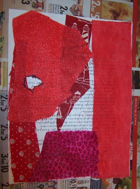
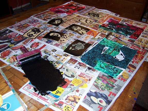
I want, above all, to have a kind of chaos to my pieces, the abstraction of something that hasn’t been created by human hands. This, of course, is impossible.

Layer two, I rolled out some block printing ink and used some old linoblocks I cut to print on the background.  Block printing works better on paper than on cloth, so the prints weren’t very clear. This is fine for my purposes.  One disadvantage with water based block printing ink is that it doesn’t dry as well as acrylic. When acrylic is dry, it’s dry.  In the past, I’ve found that trying to do washes, paint, or even a layer of acrylic gel over a block print has made the block printing ink smear and bleed.  I’m going to wait a week before the next stage, in hopes that this doesn’t happen. If it does, well, I’ll work with it.

Posted in books | No Comments

Book Covers Step 1

June 11th, 2009 by admin

green-cover.jpgmixed-cover1.jpgred-cover1.jpgI’ve been meaning to post the sequence of book covers, because what they look like changes enormously from the beginning to the end. 

First I started with three 8 1/2″ x 11″ copies of a short story of mine, which I’d converted to some funky font and printed on a laser printer. I could just have easily used plain paper, but I’m operating under the principle that more texture and more randomness is better.

Next I took some calico, because thin cotton over thin paper is the easiest material to work with, when binding books.  I cut them into scraps and strips, and used acrylic medium to paste them down.  Must wait overnight before doing anything else at this point, because the acrylic is quite gloppy.

Posted in books | No Comments

Reminder Book

June 8th, 2009 by admin

reminder-book-cover.jpgreminder-book-back.jpgThis book started, once again, with light cotton cloth adhered to an old photocopy. The photocopy was of a dictionary page with the word “swift” on it–used for another project—but you can’t see it very well now. 

To let the image show through, I cut out twin silhouettes of flying swallows before adhering it to the paper.  After that, I used one of my linoblocks and printed a flying swallow in blue-violet paint right in the middle.

This was a good start, but it wasn’t enough.  Using acrylic medium, I pasted the plastic netting from an onion bag onto the surface. It was already blue in spots from working on  the Strive book.  This looked terrible.  It looked like an onion bag glued to an otherwise promising painting.  I tried putting fuchsia mica pigments over it.  Still looked bad. Smeared the mica pigments in.  Still looked bad.  By now, the paint was starting to dry.  It was just wet enough to tear the onion bag off without ruining it.

Tearing off the onion bag produced a dragon-scale like sheen.  Not bad.  Almost interesting enough to hold its own, with a focal point.  I’d saved my favorite embellishment for this book because this book started out as my favorite. 

The metal plate was a piece of aluminum flashing that I’d cut, masked, and etched with a rubber stamp and some PCB etchant solution.  PCB etchant solution etches aluminum wicked fast, so if you try this at home, watch it closely. Muriatic acid also does a good job, supposedly, and pool chemicals are more readily available, so that project will make it onto this site at a future date.

The etched piece of metal began as a square with a border, then turned into a circle because a square wasn’t interesting enough.  A square design inside a circle wasn’t much better, so I trimmed off the sides.  I used alcohol based inks to tint the metal, and steel wool to bring out the design again.  One mistake I made was to use white glue to adhere it to the book.  Hot glue doesn’t stick well to metal, and gorilla glue has proved to be as strong as spider spit and wishful thinking (read: a waste of money), but I didn’t have anything else and thought that metal brackets wouldn’t have the right look.

What may help keep the plate on is the tape.  By now I’d figured out the theme of this book, “Don’t forget to write.” Instead of a plea to keep in touch, it’s a reminder that if you’re a writer, and writing is important to you, you have to remember to find time in your life for it. 

To make the transfer, I started by writing the phrase and experimenting with different fonts and sizes, then printed it out with a laser printer.  I centered a piece of packing tape over as many as would fit and burnished the tape to the paper, then set it in a tub of water to soak.  Once you rub all the paper off the tape, only the toner remains. When it dries, the tape becomes sticky again.  The plan was to cut out just one of them and center it on the plate. Practical considerations indicated that perhaps all of them were better than just one. The tape helps keep the plate down. The phrase that didn’t fit on one piece of tape fit on another one, so I stuck it on the spine like a title.

Posted in books | 1 Comment

Smiley Ball 4

June 3rd, 2009 by admin

smiley-balls4.jpg

Some of these I left unglazed.  I did this partly because I was running out of time to glaze, and partly because I thought I might paint some with iron-paint.  I didn’t paint them with iron paint, but I did put the unglazed ones in the damp part of the garden, hoping that they might eventually accrue moss.

Posted in smiley ball | 1 Comment

 
Wordpress Themes by and Website Templates by Blogcut