
Because we have more than one guest room in our house, it has become necessary to give the rooms names. After deliberation, we decided to name them after mythical animals. The first room to be named is the “mermaid room” because a friend who has often slept there loves the ocean and identifies with mermaids.
First, I had my daughter make a number of thumbnail sketches of what the mermaid sign should look like. She wanted coral, but I nixed it, hoping for something simpler. Our friend specified that she wanted the mermaid to be plump, because most mermaids in illustrations are model-thin. I don’t think I quite managed plump. She looks pregnant to me, as though she’s just about to dump a bunch of roe in a grotto any moment.
I had some technical issues with the draft. They might actually be user interface issues. My favorite watercolor paper has been, for many years, Cheap Joe’s Kilamanjaro paper. It’s got a nice tooth to it, a bright white, and it’s not too expensive. Second favorite is Arches CP 140lb. Strathmore is good only for practice, or for very large pieces, on account of it’s cheaper. I cut a piece of paper slightly larger than the 5″x5″ final size, taped it on to a scrap of newspaper as a blotter, and lightly sketched my mermaid. Then I began painting.
First of all, the color, which seemed vibrant on my palette, appeared to dull the moment it touche the paper. Secondly, when I tried to scrub out the blue (and it was ultramarine blue, which isn’t a terrible stainer) it didn’t scrub at all. Worse yet, the surface developed a grainy texture. Was the paint too old? Was the paper too old? Was this not, in fact, Kilamanjaro paper?
I’m still mystified, actually. It feels like Kilamanjaro paper, and the paint is maybe seven or eight years old, but I’ve never heard of watercolor going bad. The paper might have been a little dusty, but it shouldn’t have been that bad. Practice on subsequent scraps (that I know for a fact are CJ’s Kilamanjaro) are equally uncooperative.
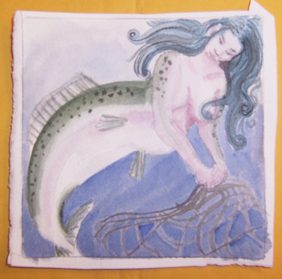
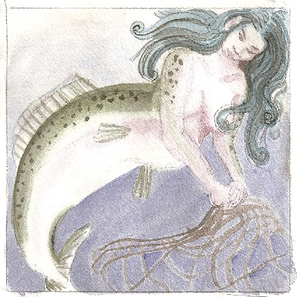
For the first draft, I sketched it out with pencil, intending to erase the lines when they were done. I’ve used this technique before. This time, the pencil didn’t go away. I don’t know why. I tried not to scrub the paint out, but the pencil wasn’t going, so I just left it. Except for the murky colors, I like the sketch draft much better than the final. She looks Japanese to me, and a Japanese mermaid feels perfectly natural.
Once I had practiced on the paper, I did the final draft on aquaboard. This is a product made by the Clayboard people. It’s basically a watercolor-paper-like surface on a masonite back. Since it’s going to be attached to a door, I didn’t want anything as fragile or heavy as a frame, but I wanted something sturdier than paper.
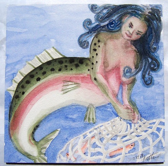
I brightened up the colors on the second one. I didn’t mix the background blue with payne’s gray, and I didn’t mix the green of the trout back with payne’s gray either. (I love payne’s gray.) I also used liquid friskit (the first time I thought the jar was empty.) I like the little orange fish in her net. I also like how well the back fin came out.
What I don’t like is her head. I can blame part of this on the initial sketch. I had her head in the wrong place, and there wasn’t enough room for the rest of her. I didn’t think the pencil would erase, however, so I was paranoid about making too many sketch lines. Her neck isn’t as long, her hair doesn’t look as natural, and her tail has a more awkward angle. I do like the colors better, especially the olive tone of her skin.
I was originally going to use the time-tested method of having the mermaid’s hair cover her nipples, but in the end, I put them in faintly, because without them she didn’t look right.
The photo of the sketch draft was done indoors with insufficient lighting. The sketchy one was scanned. The one of the final draft was done outside, under full sunlight, which is–so far–the best method I’ve found of photographing 2-D art. I have to adjust the gamma down sometimes in the final, but I haven’t found a better way of photographing my rare 2-D art. I’m just better equipped for 3-D.
I sprayed the final piece several times with tole painting matte fixative. It claims it’s non-yellowing. Time will tell.
2 comments
The sketches make her look more Japanese, but I think the final version rocks. I like that she isn’t looking seductive or soulful or silly, like many mermaid paintings. And I LOVE the thought that she’s going to drop roe in a grotto…
Good post. I definitely love this website.
Thanks!
Stop by my webpage web site (Autumn)