February 27th, 2010 by admin
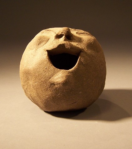
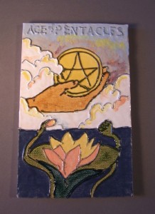
Finally got my kiln working, and was able to glaze some of the tiles I’d made last year (or was it two years ago?) I had the idea of basing some tiles off of the Tarot, because Tarot cards are defined enough to provide concrete parameters, yet still have room for personal interpretation. I doubt I will do the entire deck.
To make this design, I used B-mix clay and a slab roller. Then I tinted some b-mix slip with black stain and used a jacquard bottle to trail the lines. It is neither easy nor the best technique.
Posted in Tiles | No Comments
February 24th, 2010 by admin
Posted in smiley ball | No Comments
February 21st, 2010 by admin

For this book cover, I started with orange printed calico over paper, and again did Rorschach-like blobs of black gesso on it. I wanted to try a photo transfer onto colored paper, so I chose a blue square with brown seedpods printed on it. The transfer worked fairlywell, and I glued it to the orange background, then used a thin wash of gold acrylic paint to tie it together. In retrospect, I shouldn’ t have used such thick paper to do the photo transfer on, because the resulting cover wouldn’t bend easily over the head and foot of the spine. It’s messy, and I’m not happy with that part.
The angel statue image was dramatic enough that it felt done with an orange and a blue butterfly (the cut-out and the stamp) to make the front and back of the covers cohere stylistically.
Posted in books | No Comments
February 18th, 2010 by admin

For the cloth of this book, I used thin, rainbow tie-dyed cotton. I added black gesso just as I did to the other two books in this series. Again I wanted to experiment with photo transfers, so I transferred the images of a poritco (front cover) and gate (back cover) using acrylic medium. I love these images, but didn’t want to just leave it at that.
I had the inside of the crow from the stencil, so I adhered it to the cover, hoping it would serve as a focal point. Unfortunately, it got lost in all that black, so I did the spiral design with red paint marker. Then, to make sure the edges didn’t buckle from the glue, I laid wax paper over it and put a weight on it. Uh oh. The edges of the crow stuck to the wax paper, and lost some of their culture. I”m not sure if this is a bug or a feature, but I’m leaning toward the former. Not yet sure how to fix it, but I may yet tinker with this.
The metal work on the back was to satisfy my “stuff for the fingers to feel” urge. I started with medium weight aluminum sheeting, and looked up latin phrases on the internet. I think this one means something like “I strive to improve.” Latin isn’t just for webtemplates anymore! After I found a good, short, phrase, I picked a font from my calligraphy book and used my incising tools to impress the metal. The glue on the back should keep it from flattening too badly, I hope. The inks are alcohol-based inks, good for non-porous surfaces. I believe that with time the ink will get rubbed off everywhere but the letters.
Posted in books | No Comments
February 15th, 2010 by admin


I began this book by putting black gesso on to some printed calico in what I hoped were random patches. Once that was done, a book on photo transfers inspired me to attempt to transfer a photo. I found a photo of a landscape, and transferred it onto the cloth using a thin layer of white gesso. The colors were too bright and white for the mood, but a thin wash of color dulled it down. Sanding it dulled it down further.
The crow on the back is black gesso from a stencil i cut, highlighted with paint marker. I’m not sure what I originally planned to put in the rectangle. By now I knew what the mood of this piece was, and I hoped to find text to write there. I’m a writer too, but I usually get very self-conscious using my own words on my pieces. Shweta Narayan, a fine poet who happened to be a Clarion 2007 graduate with me, posted a draft of her poem “Epiphyte,” on her livejournal and graciously granted me permission to use it on this piece.
At one point in the poem, she references “bottle glass eyes.” so I used the bronze charm piece and a photograph of a dark child’s eye with an epoxy sticker. Going through old toys we found one of those dynamo lettering tools, and I fed some copper tape through it (used for stained glass). It looks like it says “elate,” but it doesn’t, not quite. I love the copper color though, and think it suit well.
The end papers are flocked brown and black with a victorian design.
Posted in books | 2 Comments