April 29th, 2010 by admin

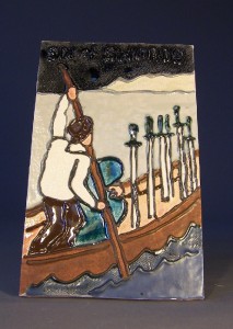
For the sky on this one I used a crystal glaze. There’s only one crystal; I’m not sure why it didn’t turn out better. When they say you need 3-4 coats, they aren’t lying.
In retrospect, I would have liked to make the distant island emerald green. This card symbolizes safe passage through a difficult situation.
Posted in Tiles | No Comments
April 24th, 2010 by admin

This is one of the most well-known tarot cards. Our local bookstore uses it as their logo.
I made the sky pink for two reasons. One, because I thought it would look like dawn (it doesn’t) and two, because I was running out of shades of light blue and didn’t want them to all look the same.
Posted in Tiles, pottery | No Comments
April 22nd, 2010 by admin

To make the surface decoration on this cup, I trailed slip made out of the same clay body. It came in handy that I had drawn several flocks of birds in my comic, coopdegrace.com, because I could draw them again without a reference.
This cup, alas, is unuseable, because it has a longitudinal crack inside. This clay body doesn’t like to be thick, but I tend to throw pieces a quarter of an inch thick for insulation and durability.
Posted in pottery | 1 Comment
April 17th, 2010 by admin

A little about the process of glazing these tiles. To do this series of twelve tiles took me about two weeks. Each glaze needs three (at least!) layers on it, and each tile has several colors. Some tiles have as few as seven (like this) and others have twelve colors or more. It’s actually easier to do more than one at the same time, because I can find three or four spaces on other tiles that have the same color. I can really only do two colors at a time (max) because otherwise I forget how many coats each has had. The first two coats go on fairly quickly, but then it takes a few minutes (twenty, perhaps) to let the second coat dry before it admits a third. Sometimes I decided that two was sufficient. I wish I hadn’t. All of these could stand thicker glazes, especially on the translucent glazes.
Another thing that makes glazing tricky is that the glazes look completely different when they’re fired from when they’re in the jar. I use my test tiles as reference, but the test tiles aren’t always accurate, because each firing has its own quirks. When I’m more experienced at firing my own kiln, I hope to eliminate some of the surprises–but not all of them! Some of the fun of ceramics comes from the unpredictability of the chemical and physical reactions of the materials.
Posted in Tiles | No Comments
April 14th, 2010 by admin

The card ‘The Moon’ almost always has two towers, a wolf and a dog, and a creature that lives in both the water and on the land. The symbolism is about the transition areas, about the gray areas. It is the interstitial tarot card.
While the glazing came out better on this tile than on some of the other ones, I’m unhappy with the photography. My photography skills have a long way to go. My mistake this time, for one, was using a lamp with fluorescent bulbs instead of getting out the speaker tripods and hooking up the spots. In some of the other ones, the color hues became too warm, perhaps as compensation for the relatively cool fluorescent light. The other problem is that the white spots from the high gloss glaze detract from the overall image. My husband suggests using gimp to edit the photos instead of Microsoft photo editor. It’s probably a valid suggestion, but I really dislike learning new programs.
Posted in Tiles | No Comments