• Home
  • About Kater Cheek
  • Writing Resume
  • Contact

Kater’s Art

artblog and writing resume

Categories

  • 48 Birds
  • alternart
  • Art Journal
  • books
  • Clarion
  • collage
  • doll/faeries
  • drawing
  • Glass
  • henna
  • Postcard
  • pottery
  • Printmaking
  • shrine
  • smiley ball
  • Tiles
  • Uncategorized
  • wood

Books!

  • Dayrunner
  • Seeing Things
  • Treemaker

My other sites

  • Occasionally Offensive

Meta

  • Log in
  • Entries RSS
  • Comments RSS
  • WordPress.org

Silkscreen crow close up

September 26th, 2011 by Kater

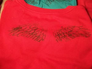
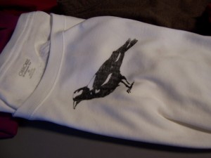
Here’s the close up of the new crow image. This is the third crow design, fourth, if you count the one that didn’t turn out. As you can see, I painted back in some of the details with a brush, since not all the lines on the head and claws came out.

To set the ink, the directions say “use iron for 3-5 minutes per side at highest setting.” I learned the hard way that this burns the cloth. Instead, I used my little craft toaster over at about 250 degrees. I fold the tee shirts up and lay them in there with the design facing up. For the most part, this works brilliantly, but this shirt got a sleeve a little close to the heating element and scorched. I’ll live with it.

One of the consistent comments I’ve gotten from this is “you should sell these” or “have you considered selling these?” With the amount of work that goes into printing one of these shirts, I’d have to charge $50 a piece to earn minimum wage. I may make some for gifts or promotional giveaways, however.

Posted in Printmaking | No Comments

Wing Close up

September 18th, 2011 by Kater

So here’s the detail of the wings that I printed using the photo emulsion technique.

I took the silk screen and poured a bead of photo emulsion liquid on it, and used the squeegie to put an even layer on both sides, as it said to in the directions. Then, I put it in a dark cabinet to dry for a few hours.

Problem: the emulsion was too thick, and it beaded up, making thick dots all over the image.

Solution: clean it off and start over.

The second time, I did a slightly thinner layer of the photo emulsion and put it in the cabinet for a couple of hours, then tried again. Taking it out of the cabinet, I put in on my desk and laid the transparency with the design on top of it. I attached the light source the directions suggested (150 watt bulb in a pie pan shade, 12″ above the image) and let it sit there for the amount of time the directions suggested (45 minutes).

Problem: the transparency stuck to the emulsion, ripping when I took it off.

Solution: let it dry more next time.

Bigger Problem: ink would not go through silkscreen, even after rinsing it for ten minutes.

Solution: clean the silk and start over.

So I did it again. This time I spread the emulsion in a darkened room and handled it at night (after letting it dry all day in a dark cabinet). Using a new transparency, as before.

Problem: Ink would still not go through the screen.

Proposed solution: get fresher emulsion.

I went to the art store and talked to the guy there about my problem. He said the emulsion was probably not bad, since it was only a couple of months old and had been refrigerated, but that 45 minutes with that light source was excessive. He also suggested using double transparency, so that I had a cleaner image. I went home and prepped a new silk with another layer of photo emulsion. Then I printed out a double layer of transparency and tried 30 minutes of light instead of 45 minutes.

Problem: Didn’t have the detail I wanted. Some of the lines didn’t come through at all.

Solution: I hadn’t been using a piece of plexiglass to lay it flat, because the one I had didn’t quite fit. However, I did find a picture frame that had a piece of glass that fit nearly exactly, so I borrowed it.

Here’s the result. The detail on the tips of the wings is missing, and I can’t see all the feather veining, but after all the effort I put into this, I’ll take it.

Posted in Printmaking | No Comments

Tee shirt print, wings

September 12th, 2011 by Kater

I got this idea from a woman who had wings on the back of her tee shirt. It was one of those currently-popular Victoriana/skateboard style of designs. I don’t know what it’s called, but here are some examples. I’m sure you’ve seen stuff like this. My daughter calls it “steampunk rock design.” It’s a specific style, full of ornate floral-like designs, often with victoriana motifs such as keys or wings, and sometimes gothic elements, such as skulls or crosses or stabbed hearts.

If anyone knows what the name is for this type of art, let me know. I see it everywhere, on bags at Target and tee shirts at Hot Topic, and other mainstream chains as well.

Anyway, I wanted to do a silkscreen of wings to put on the back of my tee shirts wiht the crows on the front, but the drawing ink isn’t detailed enough, so I had to draw it on a piece of paper with a sharpie. Then I scanned it and printed it on a transparency, and used the transparency to make the photo-emulsion silkscreen. I had issues with it. I’ll discuss it in the other post.

Posted in Printmaking | No Comments

Fake Rock 2

September 4th, 2011 by Kater

This is the second fake rock I did. I wanted the three of them to be as different from one another as possible, except for the glaze color and the concept. I started, again, by smashing the clay against a tree to give it texture, and then I put it on the wheel to carve out the smooth divot. When it had dried somewhat, I cut open a flap and hollowed it out, then closed it up again so you couldn’t tell. It’s still pretty heavy, but it’s not solid.

For the glaze, I used simple red iron oxide, which I painted all over and wiped off in places. The divot is a clear high fired glaze. I made these as candleholders, but I think that if you had a tiny spiked frog, you could use this for a pretty kick-ass ikeabana. Except that I don’t really like ikebana. But maybe someone could.

Posted in pottery | No Comments

 
Wordpress Themes by and Website Templates by Blogcut