
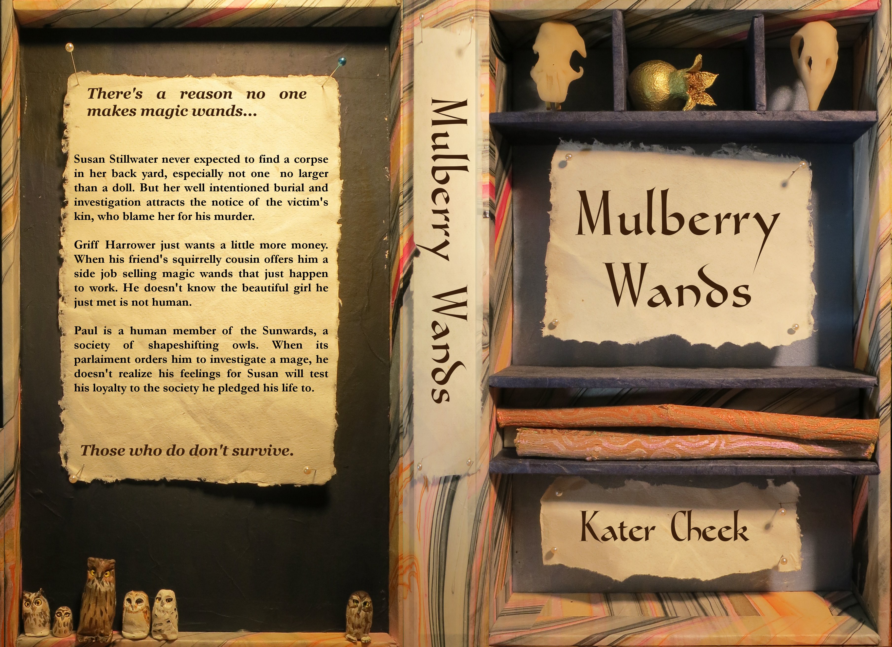
Still working on the cover for Mulberry Wands. I looked up fonts and decided on this one, Gondola, from dafont. I readjusted the skulls so you could see them better, and photographed it again, but the skulls were too far back, so I made stands for them. That didn’t work either, so I pushed them in the front. That was too far out, so I re-photographed them a half centimeter farther back. This looks better, but it’s not consistently warm, so I may tinker with it.
Changed the title font to dark brown instead of balck. I think this looks pretty good. It was suggested by my artistic children.
Still tinkering with the backflap. Not sure about the “There’s a reason no one.. don’t survive” part. Too distracting? It does set it off nicely with the block of text. Need a more dramatic color change? Not sure yet.