
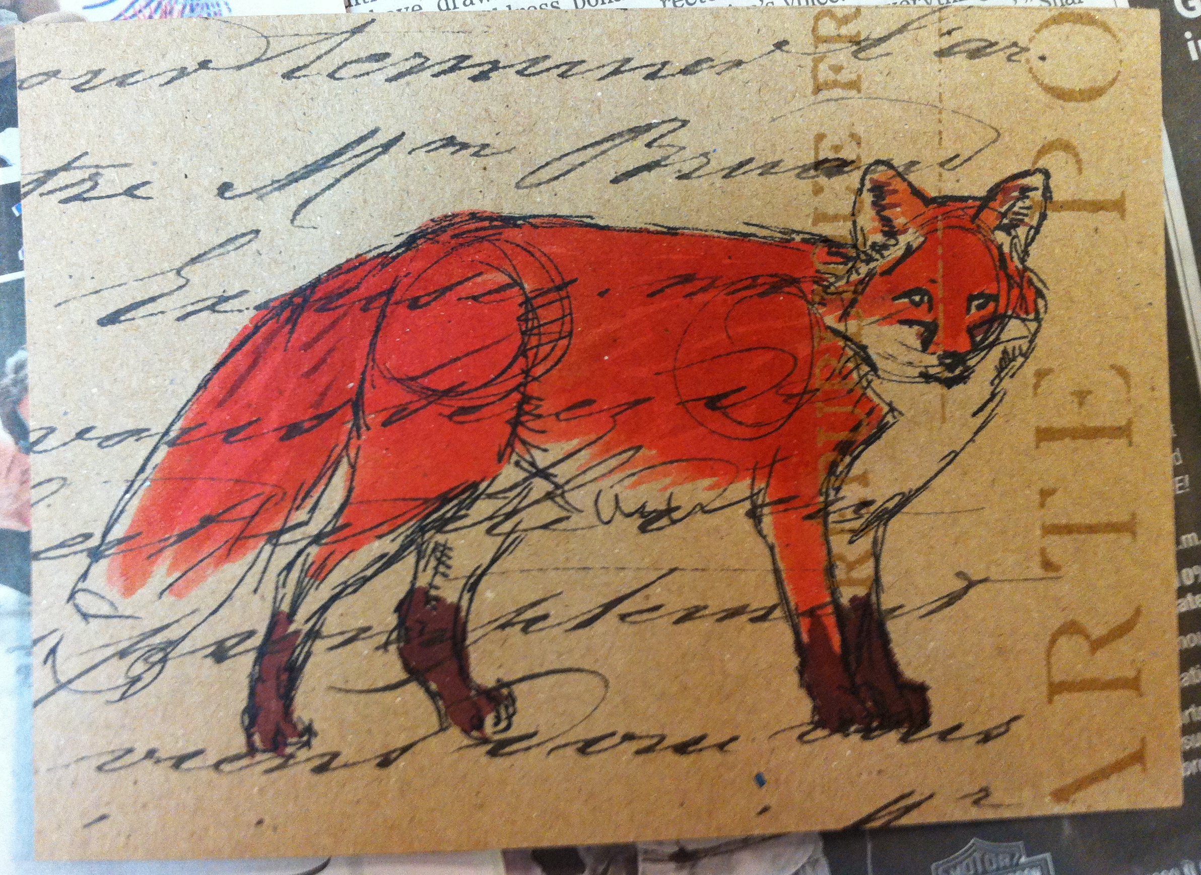
 This is the third fox postcard. It taught me something about drawing, namely that I will be happier with the drawing if I am drawing something that I like. Except for owls, which I like, but all my drawings of owls looked weird. I think it’s that the beaks are odd. But foxes are easy,and they have bright dramatic colors.
This cross-pattern worked better than the others. I like the way text looks, especially if it’s in a foreign language so that the meaning doesn’t overwhelm the picture. I’ve seen word stamps that say “hope” or “love” or “promises” or some other dramatic word, and many people will base their art around one or two big strong words like that, but it makes it feel kind of greeting-card-y or something. I dislike it, anyway. Now, if the one word is something odd, like “infiltrate” or “chelate” or “palimpsest” then it’s a different story. Then it seems to add something of interest, rather than diluting the entire piece down to a treacle-y sentiment.