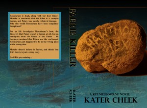
• Home
  • About Kater Cheek
  • Writing Resume
  • Contact

Kater’s Art

artblog and writing resume

Categories

  • 48 Birds
  • alternart
  • Art Journal
  • books
  • Clarion
  • collage
  • doll/faeries
  • drawing
  • Glass
  • henna
  • Postcard
  • pottery
  • Printmaking
  • shrine
  • smiley ball
  • Tiles
  • Uncategorized
  • wood

Books!

  • Dayrunner
  • Seeing Things
  • Treemaker

My other sites

  • Occasionally Offensive

Meta

  • Log in
  • Entries RSS
  • Comments RSS
  • WordPress.org

Year of the Pig Book

December 31st, 2011 by Kater

The name of this book came from the epoxy sticker on the front. My friend sent it to me from Japan, home of the most wonderful stationary stores I’ve ever seen. She sent it in the year of the pig, a few years ago, and I couldn’t bear to part with it, so I put it in my card catalog of reusable junk.

For the cover, I started with a piece of striped cotton, which I pasted a sheet of joss paper onto, much like the grackle book. Since I already had the wings silkscreen out and the gold and interference paints ready, I silkscreened a pair of golden wings onto the cloth, then got out my commercial stamps and pasted the yellow lanterns here and there for a focal point.  I tried to stamp the gold on the joss paper too, but the effect is so subtle that I can’t even make out the design.

I also used my swallow linoblock (which makes frequent appearances in my art) and made a red swallow right across the cover.  Once that was done, I was ready to glue the cover onto the book, and then I used origami paper with kimono designs for the endpapers. Only after all that was fastened securely to the book did I glue the face onto it. The face is made of polymer clay (gold clay) and I used a commercially purchased press mold. I made a bunch of them and had them lying around for when I happened to need a focal point for a book.

Posted in books | No Comments

Grackle Charm Book

December 23rd, 2011 by Kater

I made some new books, on account of it was a certain person’s birthday and she didn’t have any of my little books yet. So I made covers for the last three book blanks I had. This is my favorite of the three. I started with some simple cotton cloth from a placemat. I pasted it to a piece of paper, and then layered over a piece of joss paper. Joss paper is nice for collage because it’s quite thin, and because the inks are not colorfast, so you get some interesting bleeding.

I wanted to do some linoblock prints, so I mixed up some red acrylic and did the print of the grackle over the joss paper. I then used the rubber stamp of the music score.  At this point, it was so boring, it looked like my throwaway cover. It needed a little more chaos, so after I used gold and metallic and interference paints on my other covers, I rolled the excess paint right over the top.

Once I’d had these layers, I was happy with how it looked conceptually, and now it just needed a tactile 3D element to draw it together. I decided to use one of the brass charms, because it had been long enough since I last used it that I’d forgotten what a pain in the ass they are. You glue the circle to the brass, then wait for the glue to dry a bit, and then you put the epoxy sticker over the top. At this point, the epoxy sticker immediately curls up at the edges enough to pull your background paper right off, and then you have to glue the whole thing down and weight it, sometimes more than once.

I’d gone with a brass, copper, gold color theme, so I decided to do grommets along the spine. As you can see in the second photo, I sewed along them with thin red and copper wire. I think that’s my favorite part of this book.  I sewed the charm on the cover with red embroidery floss, and finished the inside by using blue art paper with Chinese clouds on it.

Posted in books | No Comments

Blue Steampunk Book

December 20th, 2011 by Kater

Of the three books I made this time, I was sure this one would be my favorite. I started with some cloth that I like very much, and then I got out some of my expensive interference acrylics and my wings silkscreen and made a pair of shimmery wings across it. I added other Victoriana images: the keys and the urns.

I had already decided that I wanted something moveable, and I had in mind that I would use some gear charms I bought for probably too much money. Then I realized that not all the gears had holes in the middle that were the right sort to allow them to rotate. I had a pack of this metal tape that they use for repairing ductwork, and I have a metal embossing set, so instead I decided to emboss the gears and some clockfaces (also too much money at the craft store). They emboss pretty well. When I was done, I touched them with alcohol based inks, which have a lovely random watercolor-hue.  The cool thing about this metal tape is that it’s TAPE, so when they were done, I stuck them right on the cloth. I used the spinners in the middle of the clocks as my moveable element.

The end papers are gold-brown and black abstract art from 7 gypsies.

Posted in books | No Comments

Cover Art Mockup 1

June 11th, 2011 by Kater

This is the first mockup for the cover of my novel, SEEING THINGS, which will be epublished later this summer.  To start with, I used the painted background which I made using acrylic, stamps, and layers of black gesso.  After photographing it, I scanned it and then played with the color to get a brighter red (since my acrylics are cheap and have more of a red-iron-oxide hue.)

I knew I wanted some textural background, so I wrote out a note from the novel in copperplate script on a piece of parchment with a dip pen. I also drew some images from an old book on witchcraft I have. I combined both of them with the photograph I did of titan buff and gesso on watercolor paper.

I think that if I were to do it again, I’d skip the titan buff colored texture. I wanted to have something close to the model’s skin color to mesh together so that her skin had a texture to it, but the problem is that I had a hard time not making it lighten up the red background I’d spent so long making. Once I’m more proficient in Gimp, I think I’ll be able to figure it out. Somehow I managed to do the cool masking/transparency thing with the text so that where I’d written in black, it showed up clearer and lighter. I’m not sure how I did that, but I’m keeping it.

To get the model’s skin to look like that, I moved the image to Microsoft Photo editor and used their effects tab “watercolor” feature twice.  I think I’d rather just do it once, but microsoft photo editor doesn’t have the same depth of “undo” that gimp has.

What kind of book do you think this cover is for?

Posted in books, collage | No Comments

Collaged Backgrounds

June 5th, 2011 by Kater

These are three paintings/collages I did to use as the background images for my cover art. The red one will be for my first novel, SEEING THINGS, which will be out on Smashwords and Kindle by September 1st of this year.  The green will be its sequel, TREEMAKER and the blue will be for the third in the series, DAYRUNNER.

I started by using texture plates to print with black gesso on the sheet of watercolor. I brushed black gesso around the edges too, so that it would fade into the center.  A crow figures into the plot of the second one (and I like crows) so I painted a crow in gesso.  After it was dry, I painted over with a wash in the dominant color. Using a rag, I rolled some of the paint off. You can especially see this in the blue one. When this dried, I did a third layer of color, thinning it so I had no white spots.  I also used some of the paint to do more textural prints on top of that.

These may not look like much, but they have a very specific function, and I think they turned out exactly as I wanted them to.

One interesting (in an annoying sort of way) is how yellow the cabinet behind the blue painting looks in this image. I think that’s the camera’s auto-correct function.  All of these were done in the same lighting and at the same time.

Posted in books, collage | No Comments

« Previous Entries

 
Wordpress Themes by and Website Templates by Blogcut