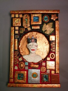
• Home
  • About Catherine Cheek
  • Writing Resume

Kater’s Art

artblog and writing resume

Category:

  • 48 Birds
  • alternart
  • Art Journal
  • books
  • collage
  • doll/faeries
  • drawing
  • Glass
  • henna
  • pottery
  • Printmaking
  • shrine
  • smiley ball
  • Tiles
  • Uncategorized
  • wood

Archives:

  • July 2010
  • June 2010
  • May 2010
  • April 2010
  • March 2010
  • February 2010
  • January 2010
  • December 2009
  • November 2009
  • October 2009
  • September 2009
  • August 2009
  • July 2009
  • June 2009
  • May 2009
  • April 2009
  • March 2009
  • February 2009
  • January 2009
  • December 2008
  • November 2008
  • October 2008
  • September 2008
  • August 2008
  • July 2008
  • June 2008
  • May 2008
  • April 2008
  • March 2008
  • February 2008
  • January 2008
  • December 2007
  • November 2007
  • October 2007
  • September 2007
  • August 2007

Blogroll:

  • Amalia Fisch
  • Black Wren Morris
  • Bridget Cherie Harper
  • Coop De Grace
  • Ecstatic Days
  • Endicott Studios
  • Glass Maze
  • Jerome Stueart
  • Keyan Bowes
  • Kolby
  • Livejournal
  • Lucy Snyder
  • My Etsy Shop-Scarletcrow
  • Nick Wolven
  • The Blatantly Obvious

Meta:

  • RSS
  • Comments RSS
  • Valid XHTML
  • XFN

Valentine Jack

February 12th, 2009 by admin

Valentine Jack

While I was making cards, I decided to make a valentine for Jeremy.  I’d already cut out the Jack of Hearts scans, so I started by glueing on on the scrapbook paper background (the scrapbook paper is to cut the print for the invitation I didn’t use.)

I bought the red handmade paper at a Japanese import store last summer. It was meant to be used as wrapping paper.  I tore a heart out of it, then cut a second heart out of the middle.  Then I painted glossy gel medium in the middle and added the pink glass beads. I liked the tiny heart from the reversed jack, so I wiped that part clear of beads.

Posted in collage | No Comments

Laura’s Crown

February 9th, 2009 by admin

Crown of Laura

I call this one “Laura’s Crown” because of the crown and because it reminds me of my sister’s style. She has a wealth of papers, paper cutters, and decorative fasteners.  Most of her creations look very tidy, unlike mine which don’t feel complete unless something had to be cleaned up afterwards.

The card on this is from a Mexican lottery game.

Posted in collage | No Comments

Lovelorn Jack Card

February 4th, 2009 by admin

Lovelorn Jack

Part of a series of six greeting cards inspired by the need to make a birthday card for Jane Cheek.

For this card I started with a greeting card blank that I’d started to stamp an invitation on (I ended up not using the invitations because evite is easier).  I cut a rectangle of scrapbooking cardstock and glued it down.  Then I cut out the jack from a scan I made.  I had the scan of the stamps too, and I liked that the colors coordinated so I ripped a piece off the photocopy.

There’s a publisher that puts out a calendar of Rumi sayings every year.  I don’t care too much for poetry, but I love the artist (Matt Manley)’s work so much that I buy a copy every year.  I mean to cut them out and frame them, though I haven’t done so yet because I don’t like the holes in the pictures.  I took one of the pictures and cut it up so that it just showed the texture.  Then I tore a piece of art paper to mimic the arc of the negative space left by the head.  I put a piece of origami paper behind it, and glued them down before adding the jack to the bottom corner.

I thought it would look finished, but there was too much middle-ground texture and no focal point.  I’d cut the heart out for another card, so I used that, which worked well since it was the Jack of Hearts on the card.  Then for another card I was playing around with laser print decals, and I wanted to put some text.  I love the way handwritten text looks on collage art, but I hate the way sharpies look (and when you’re writing on glossy surfaces, really sharpies are the only things you can rely on).  So I photocopied one of my writing notebooks, blew the text up about twenty percent, and printed a scan of it.

The full text was from a first draft of my story “Emily’s Fifth Birthday.” The sentence originally read “She’s brought Emily a designer pink tulle dress.”  With most of the text cut off, and the pining expression on the Jack’s face, it looks like he’s just come to a party and learned that someone (Emily’s mother perhaps?) has brought the object of his affection.

Posted in collage | No Comments

Jerome’s Landscape

January 31st, 2009 by admin

Jerome’s Landscape

I was originally going to use one of the etched copper embellishments I made for this, but decided against it because the metal would be too heavy to mail. When I mail letters, I tend to cut extra sheets so I can add a lot more text than the stationary-makers think a person needs, and they push the edges of allowed first class weight.

I’d saved sheets from a magazine that had nice landscapes in the background. This was from some kind of ad, I think.  I cut off the part with the people and adhered it to the scrapbook paper background.  I’d already decided to use the polymer clay embellishment (I made it when I made the other things for Jessica’s jewelry box).

I knew for this one that I wanted to have text on it. What I like best of all is hand-written dip pen on paper.  Of course, hand written dip pens are tempramental, and won’t write on glossy paper, unsized paper, or anything coated with acrylic paint: therefore, no collage work. I’d bought these laser decal transfer sheets when I bought the printable temporary tattoo paper for my practical joke last year.

I had known I wanted to do something like this, so the last time I wrote Jessica (different Jessica) I scanned a couple sheets of my letter to her.  This particular paragraph talks about my friend Jerome, and about a question he posted on our private forum asking for advice about a writing workshop.

Posted in collage | No Comments

Haloed Blue Reader Card

January 28th, 2009 by admin

Haloed Blue Reader

I’d made the linoblock of a woman reading for another birthday card for Jane, and the print was still in the pack of cards. I cut it out and placed it experimentally on the blue scrapbooking paper background.  It wanted some kind of outline, and I love the idea of using text, so I took a piece of a novel that I’d altered and cut around it.

The edge was too harsh, so I softened it by burning it with a woodburner.  I wanted to adhere it and also tint it blue or violet to match the rest, so I added some violet pearl acrylic to the tranparent gel medium.  It’s still not quite as tinted as I would like, but I jsut left it.  I also added some mardi-gras colored glass beads to the pitcute while  it was still wet. You can’t see them very well in the photo.  I also added the dove feather, just because I had it lying around.

I had already decided to make a laser decal of writing for another card, so I took the scraps of that and laid it over this, just because the colors didn’t clash.  You can hardly tell it’s a decal. It looks a little like I drew directly over the linoblock print (except I can’t make it look good just by drawing. I freeze up and don’t know what to write, and my handwriting doesn’t look natural.)

Posted in collage | 1 Comment

« Previous Entries

 
Wordpress Themes by and Website Templates by Blogcut