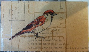
• Home
  • About Catherine Cheek
  • Writing Resume

Kater’s Art

artblog and writing resume

Category:

  • 48 Birds
  • alternart
  • Art Journal
  • books
  • collage
  • doll/faeries
  • drawing
  • Glass
  • henna
  • pottery
  • Printmaking
  • shrine
  • smiley ball
  • Tiles
  • Uncategorized
  • wood

Archives:

  • July 2010
  • June 2010
  • May 2010
  • April 2010
  • March 2010
  • February 2010
  • January 2010
  • December 2009
  • November 2009
  • October 2009
  • September 2009
  • August 2009
  • July 2009
  • June 2009
  • May 2009
  • April 2009
  • March 2009
  • February 2009
  • January 2009
  • December 2008
  • November 2008
  • October 2008
  • September 2008
  • August 2008
  • July 2008
  • June 2008
  • May 2008
  • April 2008
  • March 2008
  • February 2008
  • January 2008
  • December 2007
  • November 2007
  • October 2007
  • September 2007
  • August 2007

Blogroll:

  • Amalia Fisch
  • Black Wren Morris
  • Bridget Cherie Harper
  • Coop De Grace
  • Ecstatic Days
  • Endicott Studios
  • Glass Maze
  • Jerome Stueart
  • Keyan Bowes
  • Kolby
  • Livejournal
  • Lucy Snyder
  • My Etsy Shop-Scarletcrow
  • Nick Wolven
  • The Blatantly Obvious

Meta:

  • RSS
  • Comments RSS
  • Valid XHTML
  • XFN

Unicorn Sign

October 16th, 2009 by admin

unicorn-practice-1.jpgunicorn-practice-2.jpgunicorn-sign.jpg

Even though our bedroom is the master bedroom, and we’re not likely to change, the kids decided that our room needed to be named after a mythical creature as well. I chose the unicorn. I also noticed that you could say that each animal represents a different element, and that the unicorn would be earth. Kind of silly, but I like the synchronicity, and earth is the element I like the most.

Posted in drawing | No Comments

Phoenix/Firebird Sign

September 6th, 2009 by admin

phoenix-practice-1.jpgphoenix-practice-2.jpgphoenix-practice-3.jpgfirebird-sign.jpg

My kids (one in particular) decided she wanted a phoenix for her room, because her friend had drawn her a picture once and it looked very pretty.  I didn’t know how to make a bird look like it was rising from the ashes, so instead I painted the one from one of my favorite folktales, holding the tsar’s cherry in its mouth.

Birds can come in many different sizes and shapes, and originally my daughter wanted a peacock to be the basis of this one. I painted it, but I didn’t have any very good pictures to use as a reference.  My first practice painting came out poorly.  After I’d done two more (using a raven as a reference) I was much happier with it.

To make the stars in the background, I splattered the white canvas with liquid friskit, using a toothbrush and a paperclip.  That is, I dipped the toothbrush in the friskit and splattered the page by drawing the paperclip down the bristles.  Then I let it dry and erased it from where the bird was to go.

I realized after I’d already sprayed the fixative on it that I forgot to paint the legs, but I think it looks fine without them. 

Posted in drawing | 1 Comment

Dragon Sign

August 24th, 2009 by admin

dragon-sign.jpg

This is the sign for the dragon room.  I did a practice painting for this one, but I gave it away without photographing it first.  It looks very similar to this one.

I’m unsatisfied with how the photograph turned out. I always heard that more light is better when it comes to photographing, but that’s not quite the case here. Some of the details are obscured, and the autobalance didn’t correct all the brightnes and gamma issues.

Posted in drawing | 2 Comments

Mermaid Sign

August 9th, 2009 by admin

mermaid-final-small.jpgmermaid-draft-3-small.jpgmermaid-draft-1-small.jpg 

Because we have more than one guest room in our house, it has become necessary to give the rooms names.  After deliberation, we decided to name them after mythical animals.  The first room to be named is the “mermaid room” because a friend who has often slept there loves the ocean and identifies with mermaids.

First, I had my daughter make a number of thumbnail sketches of what the mermaid sign should look like. She wanted coral, but I nixed it, hoping for something simpler.  Our friend specified that she wanted the mermaid to be plump, because most mermaids in illustrations are model-thin.  I don’t think I quite managed plump. She looks pregnant to me, as though she’s just about to dump a bunch of roe in a grotto any moment.

I had some technical issues with the draft. They might actually be user interface issues. My favorite watercolor paper has been, for many years, Cheap Joe’s Kilamanjaro paper. It’s got a nice tooth to it, a bright white, and it’s not too expensive.  Second favorite is Arches CP 140lb.  Strathmore is good only for practice, or for very large pieces, on account of it’s cheaper.  I cut a piece of paper slightly larger than the 5″x5″ final size, taped it on to a scrap of newspaper as a blotter, and lightly sketched my mermaid. Then I began painting.

First of all, the color, which seemed vibrant on my palette, appeared to dull the moment it touche the paper. Secondly, when I tried to scrub out the blue (and it was ultramarine blue, which isn’t a terrible stainer) it didn’t scrub at all.  Worse yet, the surface developed a grainy texture.  Was the paint too old? Was the paper too old? Was this not, in fact, Kilamanjaro paper? 

I’m still mystified, actually. It feels like Kilamanjaro paper, and the paint is maybe seven or eight years old, but I’ve never heard of watercolor going bad.  The paper might have been a little dusty, but it shouldn’t have been that bad.  Practice on subsequent scraps (that I know for a fact are CJ’s Kilamanjaro) are equally uncooperative.

For the first draft, I sketched it out with pencil, intending to erase the lines when they were done.  I’ve used this technique before. This time, the pencil didn’t go away.  I don’t know why.  I tried not to scrub the paint out, but the pencil wasn’t going, so I just left it.  Except for the murky colors, I like the sketch draft much better than the final. She looks Japanese to me, and a Japanese mermaid feels perfectly natural.

Once I had practiced on the paper, I did the final draft on aquaboard.  This is a product made by the Clayboard people.  It’s basically a watercolor-paper-like surface on a masonite back. Since it’s going to be attached to a door, I didn’t want anything as fragile or heavy as a frame, but I wanted something sturdier than paper.

I brightened up the colors on the second one.  I didn’t mix the background blue with payne’s gray, and I didn’t mix the green of the trout back with payne’s gray either. (I love payne’s gray.)  I also used liquid friskit (the first time I thought the jar was empty.)  I like the little orange fish in her net. I also like how well the back fin came out.

What I don’t like is her head.  I can blame part of this on the initial sketch.  I had her head in the wrong place, and there wasn’t enough room for the rest of her.  I didn’t think the pencil would erase, however, so I was paranoid about making too many sketch lines.  Her neck isn’t as long, her hair doesn’t look as natural, and her tail has a more awkward angle.  I do like the colors better, especially the olive tone of her skin.

I was originally going to use the time-tested method of having the mermaid’s hair cover her nipples, but in the end, I put them in faintly, because without them she didn’t look right.

The photo of the sketch draft was done indoors with insufficient lighting. The sketchy one was scanned.  The one of the final draft was done outside, under full sunlight, which is–so far–the best method I’ve found of photographing 2-D art. I have to adjust the gamma down sometimes in the final, but I haven’t found a better way of photographing my rare 2-D art. I’m just better equipped for 3-D.

I sprayed the final piece several times with tole painting matte fixative.  It claims it’s non-yellowing. Time will tell.

Posted in drawing | 1 Comment

Pigeon Fire

November 15th, 2007 by admin

Pigeon FireI did this to play around with scatchboard art a little. The format is sort of an homage to Jennifer Hewitson, whose art I admire.  I finally got some decent tools, so removing larger areas of white isn’t such a chore.  The size is only 5×7.

Posted in drawing | No Comments

« Previous Entries

 
Wordpress Themes by and Website Templates by Blogcut