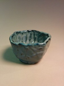
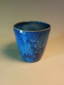
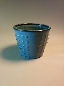
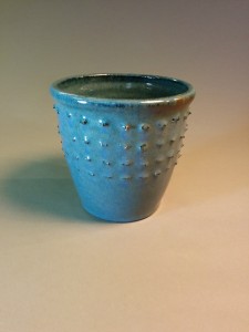
• Home
  • About Catherine Cheek
  • Writing Resume

Kater’s Art

artblog and writing resume

Category:

  • 48 Birds
  • alternart
  • Art Journal
  • books
  • collage
  • doll/faeries
  • drawing
  • Glass
  • henna
  • pottery
  • Printmaking
  • shrine
  • smiley ball
  • Tiles
  • Uncategorized
  • wood

Archives:

  • July 2010
  • June 2010
  • May 2010
  • April 2010
  • March 2010
  • February 2010
  • January 2010
  • December 2009
  • November 2009
  • October 2009
  • September 2009
  • August 2009
  • July 2009
  • June 2009
  • May 2009
  • April 2009
  • March 2009
  • February 2009
  • January 2009
  • December 2008
  • November 2008
  • October 2008
  • September 2008
  • August 2008
  • July 2008
  • June 2008
  • May 2008
  • April 2008
  • March 2008
  • February 2008
  • January 2008
  • December 2007
  • November 2007
  • October 2007
  • September 2007
  • August 2007

Blogroll:

  • Amalia Fisch
  • Black Wren Morris
  • Bridget Cherie Harper
  • Coop De Grace
  • Ecstatic Days
  • Endicott Studios
  • Glass Maze
  • Jerome Stueart
  • Keyan Bowes
  • Kolby
  • Livejournal
  • Lucy Snyder
  • My Etsy Shop-Scarletcrow
  • Nick Wolven
  • The Blatantly Obvious

Meta:

  • RSS
  • Comments RSS
  • Valid XHTML
  • XFN

Florentine-Cobalt Porcelain Cup

July 24th, 2010 by admin

Weiser first porcelain cup

This was one of the cups I threw with my share of the batch of porcelain that some of our classmates mixed up.  I had some of Kurt Weiser’s cobalt underglaze that Bridget Harper (my ceramics teacher and friend) cadged for me.  I’ve done underglaze or stain on porcelain many, many times. This is a design based off of some wrapping paper I got from a stationary store years ago. I’ve done another piece with this type of design, using a sgraffito technique, but the two look very dissimilar.

Posted in pottery | No Comments

Green Celadon Cup

July 21st, 2010 by admin

green celadon cup

This was one of a series I made from my share of the batch of porcelain we mixed up.  I tend to throw 1/4 of an inch walls on my pottery, and I’ve gotten out of the habit of trimming down to 1/8 or 1/16 of an inch walls, which is really what this porcelain wants, but this one, at least, didn’t get cracked, unlike the one with the birds on it.  This design is inspired by a swatch of upholstery cloth that a friend of mine gave me a few years ago.

Posted in pottery | No Comments

Fish Tray

July 18th, 2010 by admin

fish trayI made this using the porcelain that Bridget Harper formulated for us.  One thing that I discovered about this clay is that it does not like to be thick. I made a set of twelve small trays like this (only smaller) using the same technique (slab rolled, then formed inside a styrofoam meat tray).  All but three of the small trays I made got cracked and split apart in the bisque firing.

Knowing that this tray had a large likelyhood of breaking in the kiln, I decided not to spend too much time on the cobalt design. I wanted to try it out. This is Kurt Weiser’s own cobalt formula. I’ve done cobalt on porcelain so often, I daresay it’s my trademark.  This worked a lot better than the plain cobalt stains that I’ve used in the past. It didn’t fade nearly as much. Of course, getting the correct amount of overglaze is, well, there’s an art to it.

Posted in pottery | No Comments

Small Red Sliptrailed Cup

May 30th, 2010 by admin

.small red sliptrailed cup

One might wonder why I used a non-transparent glaze here. I was hoping that if I did it thin enough and feathered it light by rubbing it with my finger, I’d get a bright color and not lose the design.  Almost worked.  Our only translucent glazes at the Tempe Arts Center are clear and celadon–not my favorite colors.

Posted in pottery | No Comments

Red Porcelain Sliptrailed Cup One

May 28th, 2010 by admin

Red porcelain sliptrail cup 1Red porcelain sliptrailed cup 1b

When I do surface decoration on a piece I’ve thrown, I almost always have to work freehand, because I rarely remember to bring books and references from home to the pottery studio. For this piece, I remembered to bring books, and I used mehindi designs. I like mehindi designs because they are adaptable, and because the feeling of trailing a paste through a jacquard bottle into one of these traditional Vedic designs feels comfortable.

The red didn’t turn out very bright on all of this. This glaze, when it works, is quite stunning, but it needs to be reduced, so sometimes you have to hope the kiln gods favor you.

Posted in pottery | No Comments

« Previous Entries

 
Wordpress Themes by and Website Templates by Blogcut