
You can’t tell, but the rolled design on the side is meant to be dolphins cavorting in the waves. The glaze, while interesting, is too thick to show the design. I have a series of rolled stamps I made out of clay and fired that I’ve had for years. They’re great, because they make a …
Category: Printmaking
Mar 18
Blue Jay and Chintz
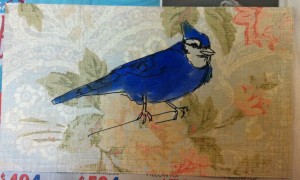
Here’s another bird drawing that I did while on the phone. I sketched it with the pen I usually write with, my favorite uniball vision elite, and when I got home I finished inking it in with a brush and some liquid blue ink. I’d hoped that the background patter would have made more of …