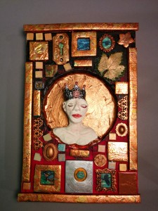
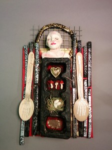
• Home
  • About Kater Cheek
  • Writing Resume
  • Contact

Kater’s Art

artblog and writing resume

Categories

  • 48 Birds
  • alternart
  • Art Journal
  • books
  • Clarion
  • collage
  • doll/faeries
  • drawing
  • Glass
  • henna
  • Postcard
  • pottery
  • Printmaking
  • shrine
  • smiley ball
  • Tiles
  • Uncategorized
  • wood

Books!

  • Dayrunner
  • Seeing Things
  • Treemaker

My other sites

  • Occasionally Offensive

Meta

  • Log in
  • Entries RSS
  • Comments RSS
  • WordPress.org

Heart Mirror Icon

September 18th, 2012 by Kater

I made this because I wanted to spend the afternoon doing art, and playing with polymer clay is a good one-day project. I have a book on making mosaics and mosaic tiles from polymer clay that I have been using as inspiration for a while.  I especially liked the icon images, which I took from a Met catalog.  I didn’t have any of the frames that the books suggests using, so I used an empty watch bezel.

Posted in Tiles, alternart, shrine | No Comments

Shadowbox of Unpartable Treasures

June 1st, 2010 by Kater

Shadowbox of unpartable thingsshadowbox door closeup

In front of my computer monitor, I collect small mementos, things I’ve been given, things I’ve made, and other things I can’t possibly ever part with. Unfortunately, it means that my monitor area gets quite cluttered.  I decided to take the large shrine blank that I had made and create a shadowbox to turn these things into art.  I’ve got glass things I’ve made (one that broke) seed pods I’ve grown or collected,  and old pair of glasses, a watermelon leaf from the 2008 garden that I pressed, and the t-shirt we designed at Clarion 2007 that I think none of us ever wore.  The copper dome in the top was made by Dylan Hasman, a metal artist married to a friend of mine (I traded him for glass doohickies).

The spiders were awards for winning the “submission game” (not what you think!) that my fellow clarionites competed in.  I submitted the most short stories, novels, etc. for two years in a row.

I’m very proud of the doors.  I cut out the sheet of copper, and used the positive on one side and the negative on the other side. I used a sheet of wood veneer to make it look like solid wood, and epoxied it to make it glossy.  Unfortunately, the epoxy poured off the edge and cemented the hinges open. Oops.

Posted in shrine | 1 Comment

Sweet and Creepy Shrine

August 27th, 2008 by Kater

sweet-and-creepy-shrine-front-sm.jpgsweet-and-creepy-shrine-open-sm.jpg

You can definitely see the Mexican influences in this piece.  I found the Mexican lottery cards at a store in San Diego, and knew I had to incorporate them in a shrine somehow.  I tried to catch the cheerful + morbid feel of Dia de los Muertos.  I was going to go so far as to make small ‘sugar’ skulls to put in the niches at the bottom, but I found Tinkerbell’s detached leg when we were going through my girls’ toy bins and I thought that would be perfect.  I had to cut grooves in the niche walls to glue it in.

Not shown: drawings on the sides of skeletons dancing in their folk finery.  It didn’t show as well as I had hoped. Acrylic paint, if it’s glossy at all, is resistant to other media over it.  I’m using gesso in another project for collage, and I hope it works better.

To get the blue/green “peeling paint” look, I painted blue underneath, and when it was dried, I smeared vaseline over it and painted the green on top. Then I wiped it off.  That idea came from a book by Claudine Hellmuth.

The beads on the spider are sewn on by hand.  The web was machine-sewed.

For the skull on the inside of the door, I made a stencil and sprayed adhesive. Then I lifted the stencil and poured the pink glass beads over the adhesive.  Quite the mess, I tell you.

The black-and-pink frame around the corazon card is a piece of mat board.  I cut slits in it and wrapped pink cotton twine around it to give the feel of spiderwebs.

For the semicircle/sun at the top, I embossed a sheet of tin.  You can see my mehindi influences in the lotus-petal shape.  Around the outside, I used some leatherworking stamps to add more texture.  When it was done, it had too much of a hat shape and not enough of a sun shape, so I painted some of the tin turquoise.

What I learned from this project: Apple Barrel acrylic paints are cheap because they are poor quality.  For this sort of project, I don’t really need thick tubes of Golden heavy bodied pure pigment artist acrylic, but Apple Barrel is below my threshold for useability.

Posted in shrine | 3 Comments

Nineteenth Century Swallow Shrine

July 24th, 2008 by Kater

swallow-shrine-front.jpgswallow-shrine-three-quarter-view.jpg

I spent last weekend assembling the base components for three more shrines, and today I finished decorating one of them.  I was originally going to have three shelves inside, each with something on it, but instead I experimented with multi-layered collage.

In the far background is a piece of a landscape. Originally I painted it myself, but I didn’t like my own painting very well, so I used one from a book on American painting.  I perused architecture drawings until I found this of the vaulted ceiling, and I cut a window so you can see the landscape behind.  There’s a quarter inch of foam core board between the landscape and the vaulted ceiling drawing, to give it depth, and there’s another quarter inch of foam core between the vaulted ceiling drawing and the sheet of plexiglass that has the small swallows adhered to the backside of it.  The larger swallow has more foam core behind it, so that it’s a little bit in front of the smaller ones.  The swallows are from Audubon.

I wanted something with a theatrical flair, something Victorian, which is why I did the flourishes on the outside in gold (stamped and embossed).  The curtains match the gold embossing powder.  I had to iron and sew them and play around with them a bit to get them to hang properly.

When I was looking for landscapes, I found a number of nineteenth century paintings.  I copied them and cut the copies into strips, collaging it onto the outside so that it would have the colors and brushstrokes of oil paintings, but not the subject matter.  I think the dark colors and reds go well with the purple trim.

Inside the attic, I put pages from a mystery novel, but I didn’t like the color of the paper, so I put different writing on top of it (purchased as part of a scrapbooking/collage paper sample pack.)  The obvious thing for the attic would be a bird’s nest, but I didn’t have one small enough, and I didn’t have any eggs even to go with the big one (except chicken eggs, which would be too large.)

I did, however, have a small bottle I made in my borosilicate flameworking class, which unfortunatley had a tempering issue and lost its bottom. Not as obvious as a bird’s nest.  Works well enough.

Posted in shrine | No Comments

Rose and Violet Poppy Shrine

June 13th, 2008 by Kater

rose-poppy-shrine-detail.jpgrose-poppy-shrine1.jpg

This shrine was inspired by the Mexican folk art shrines that honor Maria de Guadalupe and other Catholic saints.  They’re usually bedecked with candles and marigolds and photos. I love the look, but I wanted something different.

I started with an old deck of Morgan Greer tarot cards.  It took me a while to decide to use one of them, because as a rule I generally don’t like to use anyone’s art except my own. (Kind of limiting for a collage artist, I know.)  I chose this card because it was pretty, and colorful, and female, without being too serious or religious.  I painted the back of the box red, figuring that if I chose a color I liked, everything else would follow along.  I painted the inside of the box red too.

At this point, I hadn’t yet decided if I was goign to use the door on this shrine or on the owl shrine.  I assembled the main box part, and painted it with a copper acrylic paint.  I painted the roof piece copper as well.  Still no ideas, so I mixed some violet acrylic paint and rolled it out so I could use a rubber stamp and give the box some texture.  Better, but still a little bland.

By now I’d gotten far enough on the owl shrine to know that the door wouldn’t work on that one, so I started thinking about how to make the door suit this one.  I just got some sheets of copper, and I was dying to try them out, so I embossed the backside of a copper sheet and then folded it over the front of the door.  It didn’t cover the edges very well, but I had a roll of adhesive copper foil tape that I bought for use with stained glass work. I used more of this tape to cover the linen strips that serve as door hinges.

To finish the door, I went through my beads to find something that looked good as a door handle, and I painted the inside violet to complement the texture.  I’d found the magenta silk flower, and decided that looked good in the peak of the attic part, so I glued the roof on and stuffed the flower in there.

Flowers were a good theme, so I rummaged around until I found the poppy seed heads.  I’d grown these poppies last year from a package of poppy seeds I bought for making cakes and then never used.  They have very large heads.  I painted them different shades of red and purple, and two of them I leafed with red-gold leaf.  To prop them up, I used the plastic casing from a box of 22 ammo. The plastic wasn’t very pretty, so I wrapped it in magenta joss paper.  A little hot glue to put everything in place, and voila!

This is nine inches tall, six inches wide, and two inches deep.

Posted in shrine | No Comments

« Previous Entries

 
Wordpress Themes by and Website Templates by Blogcut