
Kater Cheek is the author of the Kit Melbourne series, the Alternate Susan (Desert Mages) series and numerous short fiction and other works. If you’d like to join the newsletter, click the sign up form on the right.

Witch’s Jewel
Kit Melbourne Book One
A sorcerous jewel. A mysterious uncle. Can a barista keep her magical heirloom safe from murderous crooks? If you like strong female leads, high-stakes action, and nail-biting plots, you’ll love Kater Cheek’s enthralling tale. Tap the link to buy the book today!
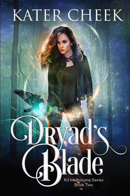
Dryad’s Blade
Kit Melbourne Book Two
A doomed man. An impossible choice. Will she bring him back with a magical cure or lose her life to a treacherous lie? If you like unstoppable female forces, supernatural quests, and complicated romances, then you’ll love Kater Cheek’s enchanting tale! Tap the link to buy the book today!

Alternate Susan
Alternate Susan Book One
Her siblings are dead. Her mom is missing. And a dangerous djinn wants payback for wishes she never made. Make a third wish and she’s doomed. But how can she go home again if she doesn’t make a wish? If you like off-kilter magic, unique settings, and non-stop tension, you’ll love Kater Cheek’s captivating novel. Buy Alternate Susan to summon a quirky desert legend today!